Ctrl+Paint - Digital Painting Simplified

Home
recent videos
Free Video Library
concept art playbook
Ctrl+Paint Store
Info
About / Contact Resources FAQ
tracing_header.jpg

Improve by Tracing

One of the earliest and most sacred lessons learned by young artists is simple: tracing is cheating.  Today we're going to break this rule, and explore how tracing can improve your artwork. 

Hand-Eye Coordination

Tracing is a legitimate option for many situations, but today we'll focus on one specific area: improving your stylus skills.  Even if you've spent a lifetime drawing with a pencil, a Wacom stylus adds a new challenge to art-making.  It may feel similar to other media, but it's not the same.  Just like the time you spent growing comfortable with the mechanics of a pencil, you'll need to do the same with your stylus.  What's the fastest way to improve your skills?  I'd recommend tracing.

Tracing worksheet - Click here to download your copy

Tracing worksheet - Click here to download your copy

Tracing Drills

Just like an athlete running through cones or a musician playing scales, simple exercises are a great way to focus your practice.  If you're trying to improve your stylus control, why worry about being creative?  When it comes to stylus control, the subject-matter you're drawing is irrelevant.   The images I've included in this post don't look exciting, but they can help cement your basic stylus control skills.  Think of it this way: before you can draw a cool dragon, you have to stop struggling with your tools.  

One Step at a Time

Eventually, stylus control will become second-nature.  Once that's happened, all of the skills on Ctrl+paint will be easier to master.  To get there, consider tracing as a valid option.  If my tracing assignments are too easy, try using some professional line drawings.  If your favorite illustrator has a website, I'm guessing they've posted a few line drawings.  Why not use those drawings as tracing practice?  It's not plagiarism to use these for personal study -- just make sure not to post your results on the internet.   Have fun tracing!

Back to top | RSS | Blog Home

PostedFebruary 6, 2014
AuthorMatt Kohr
25 CommentsPost a comment
desktop_header.jpg

Your Desktop

Our surroundings have a visceral effect on our moods.  Some people can't get anything done in a cluttered room, and others can't concentrate without background chatter.  In today's post we'll explore how this concept applies to an under-appreciated part of your environment: the computer desktop.

Like a messy room or a gleaming, minimal, office building - certain spaces yield certain results.  I can't presume to know the environment that you thrive in.  It's a bit impractical to expect to work in a perfect setting since you generally share it with classmates, coworkers, or family.  One thing you can control is your computer desktop.  Why not design it to subtly reinforce your current priorities?

Desktop as Gateway

When you sit down at your computer, the desktop is your first impression.  In psychological terms, whatever you see will "prime" your next thoughts.  Even if you're not actively considering the impact, there's a part of your brain that continues to linger on your desktop even after you start digital painting.  Some people recognize this and leave themselves "stickies" - critical to-do reminders for the day.  For me, leaving stickies would be distracting.  Instead of relaxing and preparing to paint, I would find myself dwelling on a task or errand I've been avoiding.  Bottom line: it matters what you see, and has a lingering effect.

Icons

The most clutter on your desktop probably comes from these little colorful squares.  I strongly encourage you to take an hour this afternoon and file all unnecessary icons.  What should you leave?  That's where the design part comes in.  Think of them as an outward expression of your priorities.  Are you working on improving your anatomy right now? Great - limit your desktop icons to strictly anatomy related work. An example for this might be Photoshop, recycle bin, your anatomy studies folder, and a couple direct links to anatomy tutorial websites.   You won't keep it this way forever, just while you're focusing on anatomy. 

Background Image 

Just like icons, background images are a great way to set the right tone in your work environment.  If you are currently studying anatomy, an inspiring drawing or reference photo might be a nice touch.  Personally, I love to use a flat color.  50% gray backgrounds, in my opinion, set a great tone.  Like sitting down at a recently cleaned desk, an uncluttered field of gray tells me that painting is about to happen.  My Photoshop documents will soon fill the screen, brimming with color and details -- letting the gray serve as welcome visual rest.  And of course: 50% gray won't give me a false impression of other colors.  

 What will you do to design your desktop?  Let's hear about it in the comments.


Back to top | RSS | Blog Home

PostedJanuary 30, 2014
AuthorMatt Kohr
14 CommentsPost a comment

The Radial Menu

As a followup to last week's post on custom controllers, I'd like to introduce the Wacom radial menu.  Unlike custom  input hardware, this doesn't take up any desk space - but it might be a powerful addition to your workflow. 

The Radial Menu

The Radial Menu

What is it?

Hidden inside the Wacom Tablet Properties (under the Functions tab) lies an often-overlooked gem: the radial menu.  It's a circular menu which allows you access to useful hotkeys and commands, and displays itself automatically centered around your cursor position.  This means the radial buttons are exactly where you need them to be, and don't take up screen real-estate when you're not using them.   To launch the radial menu, assign it to one of your Wacom buttons (either on the stylus or on the side of your tablet).

What functions can radial menus trigger?

radialMenu_setup.jpg

Think of them as additional stylus buttons.   Anything you can control with a stylus button, radial buttons can do the same.  Obvious choices are keyboard shortcuts and button presses.  Less obvious are operations like opening folders, controlling media playback, opening a web browser, or changing the system volume.  

As complex as you choose

The default radial menu contains 8 buttons, and for most users this is plenty.  If you'd like more, any of those 8 can trigger a sub-menu -- which contains a new set of 8 buttons.  An example sub-category might be "adjustments", containing your commonly used commands like Levels, Hue/Saturation, Variations, etc.  

Software Specific Menus

Just like other aspects of the Wacom Tablet Properties, all of these  settings can be software specific.  This means that I can have a radial menu that displays photoshop-only commands, and a different one for web browser commands.   Especially for simple software like Firefox, 8 commands are more than enough.  To create a software-linked menu, simply add an item to the application list, and have it highlighted while customizing your radial menu.

The Bottom Line

As great as a stylus might be for drawing, it can be a challenge to operate menu items, buttons, or other elements designed for a mouse.  For anytime you find your stylus lacking, a radial menu might save the day.  Though your usage will be different than mine, it's a very powerful option.  After all, how do you middle-mouse-click with your stylus?  

We'd love to hear creative uses for the radial menu, so please speak up in the comments!  


Back to top | RSS | Blog Home

PostedJanuary 23, 2014
AuthorMatt Kohr
20 CommentsPost a comment
controller_banner.jpg

Your first Photoshop controller

If you’ve been following Ctrl+Paint for long, you know that I’m a keyboard shortcut enthusiast.  To facilitate this, I operate photoshop with a custom controller.   In today’s post I’ll walk you through a weekend project: creating your own custom Photoshop controller… on a budget.  

Your layout will be different than mine, but our goal is the same: put frequently used photoshop commands within reach of your left hand - in this case, onto an external USB number pad.  We’ll accomplish this through software remapping, the opensource PC software AutoHotKey.

sctiptEditing.jpg

A numpad, transformed

The technical part is simple - you’ll create a short bit of code which temporarily transforms the numpad’s buttons into key-presses of your choice.  Once Autohotkey is installed, running the script activates your remapping -and closing the script suspends the effect.   The example to the right is a complete script which remaps 5 keys.  See a full list of numpad keycodes here.

Visit the AutoHotKey homepage to download the software.

An example line of script, sending Ctrl+E with the Numpad 1 key.

An example line of script, sending Ctrl+E with the Numpad 1 key.

Even if you've never written code in your life, autohotkey script is very straightforward.  To learn more about AutoHotKey, this is a nice overview.  For starters, each line remaps one of your numpad keys to a new function.  Using a text in a text editor (notepad, etc.), simply type "Numpad0::B" without quotation marks.  Save this script as test.ahk.  Launch this new file to test our your changes, and now your Numpad 0 key sends a "b" key-press!   To turn off the script, just look for the green H icon in your task-bar.  

keypad.jpg

Custom layout

In my example, some of the buttons are 1:1 remaps like 'b' or 'spacebar'. Others are button combinations like Ctrl+E.  You can see I’ve also rotated the device 90 degrees - a seemingly bizarre choice.  The reasoning is simple: this is my custom input device, and I do what I want.   The printed labels on the keys no longer have meaning and I won’t be reading them - so why not rotate the device to accommodate my needs?

Why the numpad?

Above all, I like using a numpad for remapping because it is non-essential.  Many keyboards don’t even have numpads, so you’re not sacrificing any standard functionality with the remapping.   Additionally, USB numpads are extremely inexpensive - making them an ideal entry-point for custom input devices.  

Logitech G13 gamepad.  

Logitech G13 gamepad.  

Where to next?

If you like the feeling of custom input devices, I’d encourage you to get creative.  Game controllers and other USB devices can all be remapped in the same way - it’s all a matter of preference.  My goal is always ergonomics, so controllers like the G13 or Razer Orbweaver are ideal (though quite expensive)  For those that prefer software changes over expensive hardware, consider studying AHK in greater depth. There’s a deep rabbit hole of possibility.  The Wacom radial menu is another option, and I'll explore that next week!  What will you remap?


Back to top | RSS | Blog Home

PostedJanuary 16, 2014
AuthorMatt Kohr
31 CommentsPost a comment
designYourEducationHeader.jpg

Designing Your Art Education (Part 3)

In the previous two parts I've laid out some of the fundamental components for your custom-designed curriculum, and you can see those posts here (part 1) and here (part  2).  Today we'll finish off the mini-series by exploring a crucial aspect of your art education: learning socially.

Unless you're a die-hard introvert, it's likely that you enjoy the company of others.  When learning art on a budget, it's easy to overlook this fact, and select a regimen of solitary practices.  Books and the internet are often the most cost effective way to learn  -- but they rarely satisfy the social aspect of learning.  How, then, can you learn socially without emptying your wallet at an expensive art school?  First, let's explore the physiological factors at work.

Social Structure

If you've ever been on a sports team, you know that exercise is more fun in a group than as a solitary pursuit.  Even if the exercise routine is exactly the same on paper, suffering through it with the camaraderie of a team lessens the psychological burden.  I can't explain the science underlying this phenomenon, but I can guarantee art works the same way.  I learned more effectively during the four years I spent at art school than I have in the 6 years since, and much of that is due to the social climate I was immersed in.  Late nights spent working on homework assignments, tough critiques, and marathon study sessions were all shared by my community of art peers.  Being in the same room with other artists - struggling and succeeding - charged my creative energy.  But we're not talking about art school, so how can you engineer social learning on a budget?

Social Art Near You

nearYou.jpg

The Buddy System - Do you have an art friend?  Make an art routine with them.  Just like jogging or lifting weights, use social accountability to motivate one another to accomplish artistic goals.  Consider sharing your results once (or more) each week.

Meetup.com - If you want to expand beyond your current group of friends, meetup offers a great way to find like-minded artists in your community.  Especially if you don't want to be the event organizer, Meetup is a nice chance to involve yourself in local art activities.

Art Lectures - Even though you're not making art, lectures are a great way to get inspired and learn about the art world.  This effect is magnified by the crowd of like-minded atendees, so consider seeing live lectures instead of online video recordings.  The society of illustrators (NY),  Creative Mornings, and PechaKucha are good examples of this, though local museums are wonderful too.  Especially if there's an art college near you, finding an lecture isn't hard to do.

Drink & Draw - If you're old enough to legally enter a pub, this is a fun opportunity.  Many cities are home to these drawing clubs.  As the name suggests, sketchbooks in these get-togethers are accompanied by pint glasses and  jolly behavior.  Even if you don't produce a masterwork, it's a fun way to meet fellow artists in your area.

Better Together

No matter what format works best for you, I'm serious about this recommendation.  Learning has a funny way of 'sticking' when you do it around friends.  Limiting your custom-designed education to  solo activities is a missed opportunity.  How will you learn socially?  We'd love to hear about your strategies in the comments, so join in the conversation!

Back to top | RSS | Blog Home

PostedJanuary 9, 2014
AuthorMatt Kohr
7 CommentsPost a comment
resolutionsTitle.jpg

Kicking off 2014

As you're making new year's resolutions this January, 'art practice' is probably on your list.  Artistic goals are wonderful, though some are much more plausible than others.  In this week's post we'll explore the art of setting (and following) manageable goals for your art.

Be specific

 In my experience the single most effective strategy for goal-setting is specificity.  All too frequently I hear someone claim that year they're going to "get better at painting".  Though great in theory, what does such a goal truly strive to accomplish?  A much more effective goal would expand on the idea a bit.  "Improve the accuracy of my color observation", or "learn to draw straight pen lines without a ruler" are much more specific.  Specific goals lead to direct action, where vague goals can feel overwhelming.  Let's consider the goal to draw straight lines without a ruler:

Turn big goals into small list items

Since my goal (straight lines) is so specific, creating a list of activities to practice is very straightforward.  One activity might be to gain confidence drawing marks with a ballpoint pen.  Filling page after page with lines, ovals, hatching, and curves would help improve your pen fluidity.  Next, watching videos on YouTube or reading about freehand straight line technique would build a foundation.   YouTube videos are generally much more effective when you have a specific search term.  Finally, you could create a worksheet designed to challenge your straight line drawing skills - and repeat it 10 or 15 times. 

As you can see from this simple example, a single goal can be broken down into smaller action items.  These items, in turn, are much more approachable because they are measurable.  The real trick is breaking large, vague, ideas into manageable action items.

For additional free videos, custom brushes, worksheets and more more check out www.ctrlpaint.com

For additional free videos, custom brushes, worksheets and more more check out www.ctrlpaint.com

Hold yourself accountable

One key to smart goal creation is creating measurable tasks.  It's hard to know if you're 'better', but it's easy to know if you're 'more accurate' (observing color,  for instance).  Even in art, many aspects of your work can be measured -- so make sure to keep them in mind when designing assignments for yourself.  For the color observation example, you could pick a target accuracy to strive for -- say, 90%.  To achieve this, practice an exercise (like the video above) a few times per week and keep track of your results. Even if you don't write these results down, it feels good to make measurable progress.

Avoid long-term goals with a 'daily' component

We respond strongly to the feeling of success and failure.  Success is fun and builds confidence, while failure damages morale and hurts momentum.  A goal to 'draw a self portrait every day' for a year is functionally the same as 'draw 350 self portraits.  The subtle difference is all about perception.  In the first scenario, missing a single day amounts to failure.  In the second example, not drawing a self portrait on one day simply slows the overall pace.  After all, what if you drew two portraits the next day?  I don't care how dedicated you are, everyone has unexpectedly busy days.  Since you're creating assignments for yourself, the rules are completely up to you. Don't set yourself up to fail.  

What are your resolutions for 2014?  We'd love to hear about them in the comments!


Back to top | RSS | Blog Home

PostedJanuary 2, 2014
AuthorMatt Kohr
12 CommentsPost a comment
gesture_title.jpg

Design Your Art Education (Part 2)

In part one of this mini-series I extolled the value of small, in-person, art classes.  Though there are a variety of subjects one might benefit from in a small class setting, 'life drawing' is a quintessential example.  In this post we'll explore the importance of life drawing & open studio courses, and the roll they play in your custom-built art education.  

What is life drawing?

Though the term is sometimes defined more broadly, I use it to describe drawing the human form.  The most useful life drawing is done in the presence of a professional, posing, model.  Often the model is nude, which prevents clothing from confusing the underlying anatomical forms.  In the abstract, life drawing is no different than still life drawing: you're looking at a subject and drawing it with traditional media.  All of the same rules apply.  The difference is an important one, though: people are really challenging to draw.  Figure drawing is a life-long pursuit.  If you don't know where to begin with the human form, make sure to watch the Ctrl+Paint video to the right.  

For additional free videos, custom brushes, worksheets and more more check out www.ctrlpaint.com

gesture_matt_kohr.jpg

The more, the merrier

As you might imagine, figure drawing offers practical challenges such as finding a model, arranging lighting, renting a location, etc.  For these reasons, life drawing sessions are much more convenient when you're not the organizer.  Luckily, figure drawing is commonly offered at local art institutions.   Community art colleges, art centers, or the local university.  Occasionally these sessions are even held at local art supply stores.   The price of these sessions varies, but in my experience $15 is average.  With a bit of research, an affordable life drawing session is probably in your neighborhood.

Photo reference vs. live models

A reasonable question at this point would be "what about photo reference?".   There's nothing wrong with learning to draw the figure from photos, but learning from an actual model is much more intense.  First off, drawing from a live human (not a photo) trains your brain to capture 3D form more effectively.  In the same way that drawing an actual still life is more effective than drawing from a photo of a still life, live models simply offer a richer challenge.  More importantly, the atmosphere of a life drawing session is often incredibly studious.  If you were to look around the room in a figure drawing session, you'd see deep focus in action.  Beginners often think that drawing a naked person would be awkward, and that the room would be filled with nervous energy.  In actuality, after the first 5 minutes or so - everyone falls into a deep, concentrated, state.  It's hard to quantify, but in my opinion this atmosphere leads to extremely productive practice.

80/20

Since all of this comes back to your budget and busy schedule, I'd encourage an 80/20 rule of thumb.  If you spent even 20% of your figure drawing time in front of a live model, the remaining 80% of your figure drawing practice could be at home with photo reference.  This format will allow you to learn lessons during the live sessions, and allow you to practice your discoveries at home.  Life drawing sessions are cheaper than art school courses, and are a fantastic investment.  Ultimately, figure drawing needs to be part of your custom-designed art education.  No matter what your end goal, make sure part of your foundation studies involve drawing the human form.  Do you have any life drawing advice?  We'd love to hear about it in the comments!

Back to top | RSS | Blog Home

PostedDecember 26, 2013
AuthorMatt Kohr
17 CommentsPost a comment
everythingElseHeader.jpg

Draw Everything Else

This week's post takes a short detour from the three part series on 'designing your art education', but it's on my mind.  The concept came from a recent conversation I had with Joe Pikop of SoMuchMonsters.  He's a teacher at FuturePoly, a Seattle game art school.  Regardless of their skill level, Joe forces his students out of their comfort zone - and I encourage you to follow his lead.

sailorMoon.jpg

Avoiding the pull of favorites

We all have favorite genres, characters, and styles - and for the sake of this post let's pretend mine is Sailor Moon.  It's tempting for me to draw nothing but sailor moon-related art, since it's my passion.  If I were to take Joe Pikop's 3D modelling class, I'd be explicitly forbidden from pursuing this passion.  His rationale is a bit unexpected.  In short, I will improve my Sailor Moon modelling skills by modelling everything but sailor moon.  Confused?  I'll do my best to break it down in terms that apply not only to 3D modelling, but to art in general.

Influence re-mix

Art is problem solving.  Every image we make tells a story of some sort - emphasizing some details at the expense of others.  These design choices are informed by our experiences as an artist, and as a person.  As you expand your horizons, your design choices are able to take on more nuance.   Let's revisit my (theoretical) love for Sailor Moon.  If all I ever watched was this show, my fan art would be limited in quality.  I would only have the existing 'solutions' to draw from.  My art would be nothing more than a re-mix of ideas from a very narrow source.  Alternately, my ability to design characters and scenes from this Anime would be improved by studying classical sculpture.  By analyzing paintings from the old masters.  By strolling through the children's section at the my local library.  The art world is massive.  The wider your experience, the more interesting your art becomes.  As my mental library expands, the design re-mix takes on new richness and depth.  Of course, I'll eventually want to practice some Sailor Moon drawing.  

remixEquation.jpg

Variety and experience

As you progress through your art education, keep variety in mind.  I'm not discouraging specialization - but it should be reinforced with broad research horizons.  It's impossible to predict how any given experience will influence your next dragon drawing.  You can predict, however, that an artist surrounded exclusively by dragon imagery won't surprise anyone with their creations.  Exciting solutions come from remixing unexpected source materials.  As Joe would say, "If you like a thing, try drawing everything but that thing". 


Back to top | RSS | Blog Home

PostedDecember 19, 2013
AuthorMatt Kohr
6 CommentsPost a comment
design_part_1.jpg

Design Your Art Education (Part 1)

Learning on the internet is great.  I'm a huge believer in the power of self-directed, solitary, learning... but it's not the whole picture.  Art is best learned with human contact.  Art school might not be an option for you, but there are plenty of alternatives.  Over the next three weeks I'll explore options for your custom-made art education.

Maximize Your Budget

 Your goal is to get the most out of your personal budget - be it small or large.  If everyone could afford art school, there wouldn't be much of a question.  At a high level, there's a correlation between class size and cost.  Huge online classes (or videos like the ones on Ctrl+Paint) are inexpensive, and small in-person classes can be quite expensive.  With this in mind, your challenge is to attend small classes when it's essential -- and large (cheaper) classes for everything else.

Paint_vs_stylus.jpg

What subjects are small classes essential for?

In my opinion, class size is most important when it comes to foundation studies.  Subjects like drawing, composition, and basic painting can be much easier to learn from a real live teacher.  If you're totally new to art, these subjects are extremely challenging.  In a classroom environment, a good teacher will catch your mistakes.  Once you've been alerted to a mistake you can begin to correct the problem.  Without a teacher, these mistakes can go unnoticed and quickly turn into bad habits.  I can tell you from experience: foundation skills are crucial.  Like the foundation of a house, they provide strength for everything that gets built on top.  If your budget is tight, focus it on small class-size foundation studies.  

A classroom near you

Even without attending art school, there's an art classroom nearer than you think.  Most cities in the US offer various levels of art education for adults: community college, and community art centers.  If you live near an art school, they probably offer 'continuing education' classes to non degree-seeking students.  CCAD in Ohio offers Saturday morning classes, which I was fortunate enough to attend for years before I was college age.  It'll take some research on your part, but these are valuable and often overlooked resources.  Your local community art center probably offers a basic drawing course - and it's probably affordable.  In this situation, you're offered a (relatively) small class size as well as a relatively low price; a great combination. 

Note:  Make sure to do your research.  All community classes aren't created equally.  Make sure to read the course description carefully, and investigate the instructor.  Is their personal work relevant to your interests?  Finding the right community class can be a challenge, but the price often makes it worth the struggle.

Find the balance

In short, aim to focus your resources on face-to-face drawing classes.  No matter how digital your final goal might be, traditional art is essential.  In the next two blog posts, I'll explore some more local options that won't break the bank.  Also, we'd love to hear from you!  Have you attended any local classes for traditional studies?  Let's hear about it in the comments!

Back to top | RSS | Blog Home

PostedDecember 12, 2013
AuthorMatt Kohr
6 CommentsPost a comment
questions_header.jpg

Common questions, answered

After reading hundreds (thousands?) of questions from the Ctrl+Paint audience, certain ones stand out.  Since these issues commonly vex digital art beginners, I'd like to take this opportunity to publicly answer three of my most commonly asked questions.  

1)  Why is my brush behaving strangely?

A common question I get regards to the way my brushes are behaving in the videos.  If you're having trouble with smooth blending, or simply want your brushes to work like mine, the first step is simple: get a USB tablet.  Nothing on Ctrl+Paint will work with a mouse.  Once you have a tablet, if you're still having problems, check out the following three videos:  

brushMisbehaving.jpg

Brush Control Basics

Brush Troubleshooting  

Opacity vs. Flow

Common problems are often solved in the Brush Properties palette.  Turning on "opacity jitter" and "flow jitter" is key, and they are found in the "Transfer" tab.  Depending on your version of Photoshop these settings might be named a bit differently.  For older PS versions, "Transfer" is called "Other Dynamics".   

2)  How can I improve drawing people & creatures?

The answer I like to give this question is a bit unexpected: practice drawing boxes.  Basic shapes like cubes, cones, and cylinders are at the core of improving your characters.  It's easy to assume that perspective is for drawing buildings, but that characters don't need to follow such rigid structure.  Wrong.  Perspective is more like gravity: you don't think about it much, but nothing escapes its influence.  For those of you struggling with drawing characters from your imagination, draw some cubes first.  I recommend these videos to help explore the issues:

intuos5.jpg

Form, Not Shape

Perspective 101

Simplifying the Head

Perspective Sketching 1: The basics (Premium)

3) What tablet should I buy?

My main experience has been with Wacom tablets.  I've used them for 15 years, and they are excellent products.  These days Wacom offers a large variety of models, and hopefully my rules of thumb can help guide your decision:

  1. Starter - Your first Tablet should probably be the cheap one.  Bamboo (or whatever the entry level is currently called) will meet your needs for quite a while.  I used an entry level Graphire for 4 years before upgrading.
  2. Intermediate -  If you've been pursuing digital art for a while and know it's not a passing fad, you're ready for an Intuos.  These have more features and sensitivity.  Medium is a good size, though some artists prefer the large one.  Personally, I've had them all and prefer a medium.  It's great for everything but fine linework.
  3. Pro -  If you're able to make money with your art, I strongly recommend getting a Cintiq.  They're fantastic for making linework, and make digital art more tactile.  I've had one for 6 years, and can't go back.  Make sure to test one out before buying, however, because some artists don't like their hand covering up the monitor and prefer an Intuos.  

It's easy to worry excessively about the tools.  Take it from my experience:  the entry level tablet is probably fine for now.  There's plenty of time for the more expensive models. 

If you still have questions, make sure to check out the FAQ section, or drop me an email.  

Back to top | RSS | Blog Home

PostedDecember 5, 2013
AuthorMatt Kohr
8 CommentsPost a comment
ctrlPaint_for_the_holidays.jpg

Ctrl+Paint for the Holidays

Digital gift cards for $10, $30, $50, or $100 are available now in the Ctrl+Paint store!

Digital gift cards for $10, $30, $50, or $100 are available now in the Ctrl+Paint store!

In the USA, today is Thanksgiving.  For some that means food and family, and for others it marks the beginning of the holiday shopping season.  When I created the Ctrl+Paint store, the idea of gifting never crossed my mind.  As it turns out, Ctrl+Paint readers love giving the premium series as gifts!  To streamline this process,  I'm happy to announce the arrival of Ctrl+Paint store gift cards.  Additionally, I want to take a few minutes this week to talk about the economics of free videos. 

Keeping the site free

As you probably know by now, most of the videos on Ctrl+Paint are free. Keeping the videos available to beginners world-wide has always been a crucial priority for me.  It's important to remember, though, that it's all made possible by the Ctrl+Paint store.  When you buy a video (or gift card) in the store, you're funding the following:

noAds.png

Ad-free videos - I hate ads, and you probably do too.  I'd love to live in an ad-free world.  Your purchases help keep Ctrl+Paint clean, focused, and free of advertising. 

conceptCoop.jpg

Upcoming premium series -  I've got a list of premium series waiting to be developed - though time and resources are slowing down the progress.  Proceeds from the store allow me to dedicate more time to creating these upcoming series.

Concept Co-Op - I'm currently developing a gigantic concept art club called "Concept Co-Op".  Just like Ctrl+Paint, this will be free for anyone to join.  Unlike Ctrl+Paint, it doesn't have any ability to generate revenue.  If Concept Co-Op sounds like a cool project to you, know that Ctrl+Paint store proceeds are helping to make it possible.

A big "thank you"

Thanksgiving offers a time to reflect on the things we're grateful for.  Even if you're not from the US, it's like a pretty solid holiday tradition.  Here at Ctrl+Paint, I'm extremely thankful for you.  You and your fellow readers are the ones that make all of this possible.  The current spread of the site has blown past my wildest expectations.  Alone, I'm just a guy making videos.  With you, and the other readers, Ctrl+Paint is a community. Thank you for all of your support and hard work.  Now let's get ready for another awesome year of digital painting!


Back to top | RSS | Blog Home

PostedNovember 28, 2013
AuthorMatt Kohr
5 CommentsPost a comment
displayingYourArt.jpg

Displaying Your Work

Walk into a nice art gallery or museum, and you immediately a sense for the artwork's importance.  Starkly illuminated on a white wall, paintings command attention and respect.  Walk into a cluttered gift shop and you get a very different impression.  Even if you're not displaying your art in galleries, it's likely that you are displaying it to the public.   Is your portfolio sending the right message about your artwork?  This post deals with the importance of presentation.  We'll focus on web design - though the same concepts can be applied to your physical portfolio.

gallery.jpg

Less is more

 When objects are surrounded by negative space, they're empowered.  Artwork with room to breathe just feels... strong.  By selecting one image out of 100 to place on a wall, it is automatically imbued with authority.  As you construct a portfolio website, the first and most important step is to be selective.  If you want to express 'art gallery' not 'gift shop'.  Choosing a small set of strong portfolio pieces is essential 

Emphasis

Galleries are spaces designed to direct the viewer's attention.  Instead of getting lost in the sea visual clutter, the art stands out as important. Through intentional use of lighting, contrast, and wall color the artwork it emphasized.   Have you watched my free videos on the Principles of Design?  If so, these principles might sound familiar.  The same rules that help guide a viewer's eye through a composition can be applied to your website or portfolio.  Specifically, using contrast emphasis to intentionally direct the eye.  The Apple store and website are great examples of this spartan clarity: you can't mistake what they're trying to sell you.  There's nothing to visually distract from their products.  When making your personal website, how can you borrow these successful principles?  

Interior of the Apple store

Interior of the Apple store

The value of good craftsmanship

I wish that this would go without saying, but here goes: review your work before uploading it to the internet.  It's painfully simple, but I can't tell you how many sloppy portfolios I've seen from beginners.  Regardless of the work itself, clean presentation empowers any image.  Are you adding borders to your work?  Make sure they're the same width and color.  Do you sign the images?  Keep your signature size consistent.  Are you placing a watermark on each image? Keep it small and along the bottom edge.  In short, make it clear that you care.  Inconsistency can communicate a disinterest or lack of focus.

It all adds up to 5 crucial seconds

Your website or portfolio is the ultimate 'first impression'.  Like it or not, it's going to be met with snap judgments.  The first few seconds might be all it takes for a viewer to dismiss your art completely.  Alternately, the first five seconds might entice the viewer to scour your entire portfolio.  With all of this on the line, make sure that the first impression is a good one.  After all, stepping through the doors of an Apple store sends a very different first impression than walking through the doors of a cluttered gift shop.  Which experience would you rather create?


Back to top | RSS | Blog Home

PostedNovember 21, 2013
AuthorMatt Kohr
4 CommentsPost a comment
cooperation_vs.JPG

Competition vs. Cooperation

The internet offers artists a host of advantages previously unavailable.  Cheap tools, free education - the list goes on and on.  Unfortunately those boons have come along with certain cultural pitfalls.  In today's post I'm going to talk about about the competitive nature of art on the internet, and propose some alternatives.

cooperation_sidebar.JPG

The internet vs. the commercial art world

As a concept artist at a game studio, it's safe to say that great things happen on teams.  I am more creative due to my team mates.  Moreover, I am able to play my specialized role and contribute to a much larger final product.  On my own I could never create a video game.  Despite all of these positive aspects of teams, art on the internet is often very solitary.

It's a safe bet that you've seen or participated in an online art challenge.  Despite the overwhelmingly cooperative nature of the commercial art world, the internet offers a different arrangement.  On sites like conceptart.org you're often given a prompt and a deadline, and let loose to compete against your online art peers.  Even if there's no physical prize, this format brings out a competitive spirit in artists.  Public portfolio reviews, critiques, or general forum behavior can bring out a similar thorny nature for artists.

The result, in my experience, is that artists are conditioned to be secretive and territorial with their artwork.  Competitions are won by standing out - not by sharing and collaborating.  If your only access to art education is on the internet, this can provide a very one-sided view of art culture.  

Team psychology

One great aspect of teamwork is the sense of camaraderie and shared knowledge.  Good times and bad are experienced as a group.  This arrangement leads to an atmosphere of sharing: techniques and solutions are more valuable when your teammates know them as well.  Working on teams also creates a sense of social accountability.  Like having an exercise routine with friends, working with peers encourages everyone to push beyond their comfort zone.  Ultimately, a 'bad drawing day' is much easier to bear when you're surrounded by other artists.

Where is your team?

The preceding list lays out a strong case for working on an art team, but you might not know where to begin.  It's easy to find solitary competitions on the internet, but it's not as easy to find collaborative efforts.  The best answer I can give is to start anywhere.  We all have access to social networks, which make the communication part of the equation much easier.  Better still, though, is a group that meets in a physical location.  Starting a club at your school or college is a great way to work on a group project.  The end result is less relevant than the experience along the way.  Even though you might end up with a nice portfolio piece or two, the interactions with other artists is your real reward.  If you plan on entering the world of commercial art, a little practice ahead of time is a great idea.  And most of all, it's fun!

Have you ever participated in an art team?  If so, where did you find them?  Did you have to create your own club?    We'd love to hear about your experience in the comments.


Back to top | RSS | Blog Home

PostedNovember 14, 2013
AuthorMatt Kohr
5 CommentsPost a comment
Artwork by Robh Ruppel

Artwork by Robh Ruppel

Realism vs. Simplicity

Realism is both necessary and overwhelming for beginner artists.  Capturing realism seems to be an impossible challenge: the natural world offers an endless level of detail to reproduce.  In this post I'll argue a different approach to realism, using the landscape paintings of Robh Ruppel as an example.  

Artwork by Robh Ruppel

Artwork by Robh Ruppel

Ruppel's paintings, found on Graphic LA and his portfolio site, appear extremely realistic at first glance.  They 'read' as photographic, though upon closer inspection are quite graphic and simplified.  Let's take a closer look at the principles that allow him to imply realism without spending hundreds of hours painting tiny details.  

Tone and Hue

Squint your eyes at this painting of the desert, and you could convincingly be looking at a photo.  The detail image proves, however, that the surface textures are anything but photographic.  Squinting at a painting allows you to ignore surface and small scale details, focusing only on light and form.   This shows that Ruppel is telling most of the story through carefully arranged values and hues.  A shadow painted too dark, or a highlight painted too intensely would break this illusion of realism.  

Artwork by Robh Ruppel

Artwork by Robh Ruppel

Observational Accuracy

These paintings depict real spaces with real light.  As such, they are 'observational' images (even if they were based off of photographs).  Where they succeed is in their accurate selection of colors -- which is not easy to do.   The graphic, simplified, paint strokes leave no room for error.  Each color has been carefully tweaked to capture the scene.   This careful selection of color and tone creates a strong sense of realism, though it doesn't rely on photographic surface details.  It's this sort of painting that is never threatened by the technical achievements of the camera.

Don't be Afraid

If you're intimidated by landscape painting, it's probably due to the density of small details.  These paintings from Ruppel prove that realism doesn't need to mean photorealistic.   

With this in mind, approach your next landscape painting with simplicity in mind.  The image to the above right (Santa Monica Sunset) is a great example of this principle.  Large shapes are much more important than tiny details.  Focus more on the arrangement of values and colors - and less on the tiny little details.  It's not to say your next painting will be as successful as Ruppel's, but it's fun approach to try out.  If you've watched many of the Ctrl+Paint videos I run the risk of sounding like a broken record -- but it's all about working on the big picture first, and then adding detail on top.  A strong foundation (in this case, value and hue) is three quarters of the battle.  And if you haven't checked out the other paintings from Robh Ruppel yet - make sure to do so!


Back to top | RSS | Blog Home

PostedNovember 7, 2013
AuthorMatt Kohr
3 CommentsPost a comment
eat_sleep_header.JPG

Eat & Sleep

Being a professional artist, or a serious hobbyist, is a lot of work.  Art tutorial sites and art schools often leave out  two crucial aspects in the life of a working artist: eat and sleep.  In this post I’ll take a look at some important habits to keep you happily drawing for years to come, and how to learn from my mistakes.

zzz.PNG

Sleep

I can’t stress the importance of sleep strongly enough.  It seems that the ‘all-nighter’ has been burned into popular culture as a badge of honor.  Movies often portray creative types working late into the night surrounded by caffeinated beverages.  As romantic as this visual may seem, it’s a terrible habit to get into.  I spent my final year of highschool pursuing this image - creating digital art deep into the night and attending school during the day.  The most noteworthy result of this lifestyle was how awful I felt.  Artistic progress was certainly made, but it came at a huge cost.  At the time I saw this as a necessary trade: I could sleep later.    The truth, though, was that all of my waking hours were less effective due to my general exhaustion.  If you want to learn more about this concept, read about “sleep debt”.  

Being well-rested improves every minute you spend working.  My new strategy is to sleep as much as I can.  If I get 7 or 8 hours, each night I’m significantly less likely to have a ‘bad drawing day’.  It seems that shorter work days are in fact more effective than long ones if they’re followed by a good night’s sleep.  It’s possible that this schedule is at odds with your school or work life, but I can’t overstate the difference it’s made in my art effectiveness.  

junk_vs_food.JPG

Diet

Like a good night’s sleep, eating healthy food makes a huge difference in your long-term artistic output.  Working in a game studio, I’m no stranger to pizza and potato chips - but this is a dangerous lifestyle to sink into.  Crashing a few hours after eating a candy bar or heavy, processed, lunch will ruin your creativity. For much of my life food hasn’t been a huge priority.  It wasn’t until late in college that I began eating intentionally: cooked meals, lots of vegetables, and fresh fruit when it’s available.  Since that time I’ve felt a huge improvement in my general energy level and mood.

Invest time in your health

It’s easy to slowly slide into low energy levels and a grumpy disposition without understanding the causes. Art is much harder to make under these conditions.  It’s hard to know where the impact of sleep ends and diet begins, but the two combine to have a huge impact on your daily life.  If you want to pursue an artistic career, technique and theory aren’t the only skills you’ll need.  Learning to stay healthy, rested, and well fed will keep you happily painting for years to come.

Do you have any tips for the Ctrl+Paint community?  We’d love to hear them in the comments!  


Back to top | RSS | Blog Home

PostedOctober 31, 2013
AuthorMatt Kohr
14 CommentsPost a comment
learningSequence_title.jpg

I'm teaching myself to draw. Now what?

One common response to the videos on Ctrl+Paint is a simple question: "What should I be drawing to practice?"  Especially if you're teaching yourself to draw and paint, it can be challenging to find homework assignments.  In this post I'll go over a few options, and would love to open the topic up for discussion in the comments.

Examples

  • Coffee mug  / tea cup
  • Spoons 
  • Food items
  • Vase (with or without flowers)
  • Sea shell(s)
  • Chairs
  • Bicycle
  • Full still life

Step 1 -  Drawing from observation

The first phase of your learning should be from direct observation.   Luckily, the subject-matter is totally up to you.  It's common to start with still life drawing using simple objects.  If that doesn't interest you, simply look out your window or take a sketchbook to the park.   Essentially, drawing anything from direct observation is challenging - for beginners and pros alike - and it's hard to go wrong with subject-matter.  Drawing simple shapes like mugs and plates will help practice your 3D form and light, while complex objects like flowers will test your understanding of surface texture.


Examples

  • Fashion model / outfit
  • Sports car
  • Landmark  / building
  • Wildlife (ideally in exciting poses)
  • Athletes in motion
  • Space suit / other uniforms
  • Exotic locations
  • Flowers
  • Bugs


Step 2 - Drawing from reference

Especially once you're drawing digitally, direct observation can be a challenge.  Additionally, landscapes can be hard to draw from observation.  Once you've grown comfortable with drawing from direct observation, reference photos are a great second step.  These can be from magazines or the internet.  The downside to drawing from reference is capturing a sense of volume.   Direct observation allows you to fully understand the 3D shape of your subject, while photos artificially flatten dimension.  On the positive side, photo reference will freeze your object in space.  When the camera angle never shifts, it can be much easier to capture accurate shapes in your drawings.   


Observation to Imagination - now available in the Ctrl+Paint store.

Observation to Imagination - now available in the Ctrl+Paint store.

Step 3 - Drawing from your imagination

Dragons, space marines, and elves are what we're all here for.   Sadly, you have to be comfortable with steps 1 & 2 before moving onto fantastic subject matter - since traditional drawing skills are essential for drawing from your imagination.  I think of it this way: learn the fundamentals, and then have a great time with the fun stuff.  If you skip the fundamentals, the imaginary stuff won't be fun.  With this in mind, I've created two premium series in the store devoted to the transition from observation skills to imaginary drawing.  The second part is a set of 40 homework assignments. When you're teaching yourself to paint the course can seem unclear - this series aims to provide a bit of structure.

Currently the Ctrl+Paint store does not have any premium series aimed at steps 1 & 2 - though it's an idea for the future.  If you've already purchased the Observation to Imagination 2 part series, what did you think?  We'd love to hear your feedback in the comments.  

Back to top | RSS | Blog Home

PostedOctober 24, 2013
AuthorMatt Kohr
9 CommentsPost a comment
play_header.jpg

Play & Learning

Learning to draw or paint digitally can feel like an extremely serious matter.  Especially if you plan to be a professional, the task of learning can feel a lot like work.  Unexpectedly, though, we often learn more easily though play.  In this post I'll talk a bit about play, and how it might relieve some of the stress of learning to paint.  

play.jpg

Games & Learning

You've probably heard parallels drawn between organized sports and learning to hunt.  In cultures that needed to hunt for survival, those skills were often taught to children in the guise of sports and games.  In this way children spent the necessary hours honing technical motor skills - but did it because they were having fun.  The hunting analogy doesn't hold up quite as directly for artwork, but the mental state is an important one.  Telling a child "learn to throw a ball so you don't starve" is a lot different than "learn to throw this ball because it's a fun challenge".  

"Getting better" is not inherently fun.  I'd argue, however, that having fun actually increases your chances at getting better.  Like children mastering motor sports through athletics, learning is simply easier when you're having a good time.  For children, art is automatically fun.  At some point we lose this natural carefree attitude, and drawing risks becoming a means to an end.  What is lost, in my opinion, is a willingness to take risks.  The fear of failure can prevent us from cutting loose and enjoying the process.  As an learning artist, you'll need to actively seek out the fun and experimental state that children find so naturally.

sketchbook.jpg

Sketchbooks 

Sketchbooks are a great way to lower your personal expectations, reduce the fear, and have fun with drawing.  Make a habit of carrying one of these little books around with you, and you'll be amazed how easy it is to draw every day.  Sketchbooks are inherently fun because no one will care about the result.  They're for you and you alone, so why not go nuts? 

Experimenting with new tools

Any time I learn a new technique, tool, or command, I like to play around with it.  If I'm using Photoshop, I'll open a new document and experiment wildly -- not pursuing a specific end result.   My only goal is to try the new technique from all angles.  Working this way is more 'sandbox'  and less 'blueprint.'  New tools are often unpredictable - so poking and prodding them is extremely important.  When you eliminate the need to produce something beautiful, you'll have a much easier time digging into the unexplored territory.       

Pick a time to play

If you're learning something new, I encourage you to take dedicated time to play with it.  Maybe it's a 15 minute warm-up, or maybe it's an hour on the weekend.  No matter what form it takes, make sure that you're not secretly hoping to create something beautiful.  During play time, the goal is discovery.  That's it.  Have fun with it!   


Back to top | RSS | Blog Home

PostedOctober 17, 2013
AuthorMatt Kohr
14 CommentsPost a comment
cc2.jpg

Adobe Creative Cloud Pt. 2

In the last post I talked about new features offered by Creative Cloud.  Based on some of the more passionate comments, it's clear that new features aren't the defining aspect of CC;  you want to hear about the price. Earlier this year Adobe announced that they're no longer offering boxed versions of the software, that it will now be a subscription service.  Many artists were outraged by this news, and I went as far as signing an online petition to show my disapproval.  In short, I was ready to hate CC.  That was six months ago, and since then I've had a lot of time to think about and experiment with the new software.  Today's post will explain my thoughts on the matter.

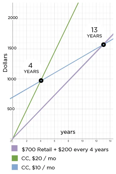
CC_chart.jpg

What does it cost? 

In the United States Photoshop CC costs $20 / month.  If you're a current Photoshop customer (CS3 and beyond), it's $9.99 a month - although you need to sign up before Dec 31st to get this price.  Let's compare this new price to the traditional Photoshop model: $700 plus an additional $200 for each upgrade.  For my comparison I've assumed a user upgrades every 4 years. The intersections on the graph show at what point the CC subscription becomes more expensive than the traditional model.  At $20 / month, CC is cheaper for the first four years.  At $9.99 a month it's cheaper for the first thirteen years.  

How is the software different than it used to be? 

The short answer is: not much.  The "Cloud" format offers a few extra features, though they're largely throw away -- the primary difference is the frequency of updates.  As a subscriber, you'll get updates every few weeks instead of waiting for a major release.  Beyond that, it's the same old Photoshop.  Sadly, digital painters seem to get fewer cool new features than photographers do.


blue.jpg

What's the real question? 

This issue has been a very contentious one for the Photoshop community.  As I mentioned earlier, I was ready to hate it  - and would have told you all about it in this post.  I think, though, that we're been asking the wrong question.  Ask yourself: "is Photoshop a valuable part of my artistic life or career?"  If so, $20 a month seems much more reasonable.  $10 is undeniably a bargain.  Listen: art is expensive!    A tube of blue oil paint (pictured left) costs $43.  The average oil painter certainly pays more than $20 per month on supplies.  

Is CC for you?

If you're the sort of user that is satisfied to install Photoshop CS1 and use it for a decade, than CC is not for you.  If you anticipate being that sort of user and don't have a copy yet, go grab a CS6 box for $700 while they're still in stores.    For everyone else, it's a question of "Adobe or Open Source"  (I'm looking at you, Gimp).  For beginners this is great news!  There's never been a cheaper (legal) way to use Photoshop.  At the end of the day, there's not much choice in the matter: Adobe has switched to a subscription model.  It's likely that the pricing will change over the years, but don't count on boxed versions coming back anytime soon.  I wish there was a strong competitor to Photoshop, but sadly... there isn't.  But lets face it: Photoshop is extremely powerful, stable, software.  Frankly, that's worth $20 (or $10) a month.

What are you going to do? 

Seriously, we want to know!  I've seen a lot of angry rhetoric about this issue.  I haven't seen a lot of alternatives.  If you're angry about the switch in business model, what's the next step for you?  We want to hear about it in the comments.  The price is likely too high for certain segments of the Ctrl+Paint population, and we'd love to hear useful alternatives.  We don't need to hear more arguments about Adobe's pricing.  The internet has done plenty of that already, and Adobe has clearly made up its mind.  


Back to top | RSS | Blog Home

PostedOctober 10, 2013
AuthorMatt Kohr
35 CommentsPost a comment
adobeCC.jpg

Adobe Creative Cloud Pt. 1

Previously Adobe Photoshop has been boxed, retail, software.  I personally own a copy of CS5, and before that had a student edition of CS2.  As of this year, Photoshop is now only available as a subscription service called “Creative Cloud”, or CC for short.   If you already have an old version of Photoshop, you might be wondering whether or not CC is for you.  This week and next week I’ll take a look as some useful new CC features, and give my thoughts on the subscription issue.

chrisOatley.jpg

I had the chance to chat with Chris Oatley on a recent Artcast.  It's certainly worth a listen if you haven’t heard it yet.  Since then I've been contacted by the nice people at Adobe and given a year of CC to experiment with.  I’m happy to report that some of the largest complaints I raised on Oatley’s Artcast have been eliminated by CC.  Specifically reordering custom brushes and changing the brush tip angle.  

Reordering Custom Brushes

In the past managing your custom brushes has been a huge pain.  It’s still a medium sized pain, though one major improvement has been made: drag-and-drop reordering in the preset manager.  Now it’s possible to manipulate the order of your brushes - whether you want to add a new brush near the top of your list, or group your existing brushes into categories.  It may not sound like a big deal, but it’s absolutely had an impact on my workflow.

brush_tip_rotation.png

Brush Tip angle

One more feature that improves my day-to-day experience is the Brush Tip Angle.  Traditionally, to change the angle of a flat brush tip you would need to open the brush properties panel.  In the “Tip Shape” tab, you could rotate the brush tip profile.  It was a huge pain.  In CC, this control has been shrunken down and crammed into the right click brush palette.  Now when you right click, the brush profile is directly next to your cursor position!  For those of us that use flat brushes, or brushes which need to be rotated… this is a huge improvement.  

interfaceSwatches.png

User Interface Themes

Though not strictly a CC addition, CS6 brought an extremely useful cosmetic change: interface themes.  Now you’re given the option to select one of 4 options, ranging from light gray to nearly black.  Beyond the simple fun of customization, this can play a large role on your perception of color and value.  This old Ctrl+Paint video explains a bit about ‘color relativity’, and is worth a watch.  In short, your perception of brightness / darkness can be thrown off by the color of the image’s frame.  If I’m working with a dark image, I’ll switch to a dark UI.  A light image is easier to work with using the lighter UI.  Having 4 to choose from means that I can quickly decide which makes the most sense for my current image, and switch without any trouble.

Next Week

These features are nice, but are they worth an upgrade?  In next week’s post I’ll give you my current opinion on the issue of subscribing.  Having only played with the new version for a month, this may not be my final decision - but I’m getting a pretty good sense of it.  Stay tuned.  If you have any experience with adobe CC, let’s hear about it in the comments!

Back to top | RSS | Blog Home

PostedOctober 3, 2013
AuthorMatt Kohr
26 CommentsPost a comment
clouds_by_paulVallejo.jpg

Cloud Shapes

When you were a kid, you (almost certainly) looked at a sky full of clouds and saw more than water vapor.  Instead, you saw an ever-shifting sea of shapes: animals, characters, and fantastic landscapes.  For a variety of reasons this is less common for adults.  In this blog post we'll look into the issue of adult imagination, and why 'cloud animals' can be a practical tool for adult artists.

Imagination is encouraged in children, but often withers as we age.  When was the last time you were encouraged to daydream?  I'm not sure if this phenomenon is physiological or cultural, but it's clear adults spend less of their time pretending.  I'd argue that artists benefit from breaking this trend.  Artists, especially illustrators and concept artists, have a lot to gain from pretending.  

Idea Generation  

Answering the question "what should I draw today?" can be extremely challenging for beginners.  Art, after all, is not just about technical skills.  Creativity is often equally important to rendering and technical craft.   When considered through this lens, "watching cloud animals" becomes a very productive activity.  Instead of a leisure activity, it can be thought of as brainstorming.  Our brains are especially good at seeing patterns in random noise.  Harnessing this power toward artistic brainstorming is valuable for kids and adults alike. The Ctrl+Paint video to the right is also about generating ideas, and will provide some additional resources.   

Structured Daydreaming

I encourage you to look for cloud animals.  In fact, don't limit yourself to animals -- look for hidden shapes wherever you are!  Dedicating time to this activity is extremely useful, and it is best accomplished in a dedicated way (no multi-tasking).  Next time you're waiting for the bus or want to jump-start your brainstorming, search for these imaginary shapes.  If you're having trouble, I'll use this tree trunk to explain some exercises: 

tree_by_thomas_gertsberger.jpg

Juxtapose scale:  Forget that this is a tree.  What if it were 1,000 times larger?  What if we're actually looking out the window of a spacecraft onto the surface of a planet?  What natural phenomenon would explain the crevasses and ridges?  In short, a dramatic change in scale can get your ideas flowing.

Distill 2D patterns:  If you're trying to design a textile pattern, logo, emblem, or mark - natural shapes are a great place to start.  The specific swirl of this bark, or potentially the grain of the wood fibers -- when taken out of context can provide compelling graphic motifs.   

Upside-down: Sometimes all it takes is turning an object in an unusual orientation for interesting shapes to appear.  This helps you break your existing mental associations, and allows you to consider an object with a blank-slate.  What's on the inside of an acorn cap?  What about the under side of a mushroom?  Nature has tons of exciting surprises - make sure you're taking advantage!  


Back to top | RSS | Blog Home

PostedSeptember 26, 2013
AuthorMatt Kohr
7 CommentsPost a comment
Newer / Older
store_footer_concept_d.png