This final video in the series was created in response to a number of comments -- obviously I wasn't being clear enough, so hopefully this explains it!
Posted
6 CommentsPost a comment
This final video in the series was created in response to a number of comments -- obviously I wasn't being clear enough, so hopefully this explains it!
Some composition guidelines are abstract and vague. Tangents, on the other hand, are very straightforward. As the video shows, they're a quick way to add visual confusion and flatten the depth out of an image. Once you know what to look for they're easy to avoid - and then you can be tangent-free for good!
And if you like this video, please remember to click the “Like” button at the bottom of the post! The only advertising for Ctrl+Paint is word of mouth, so I’m counting on you guys to spread the word. Thanks!
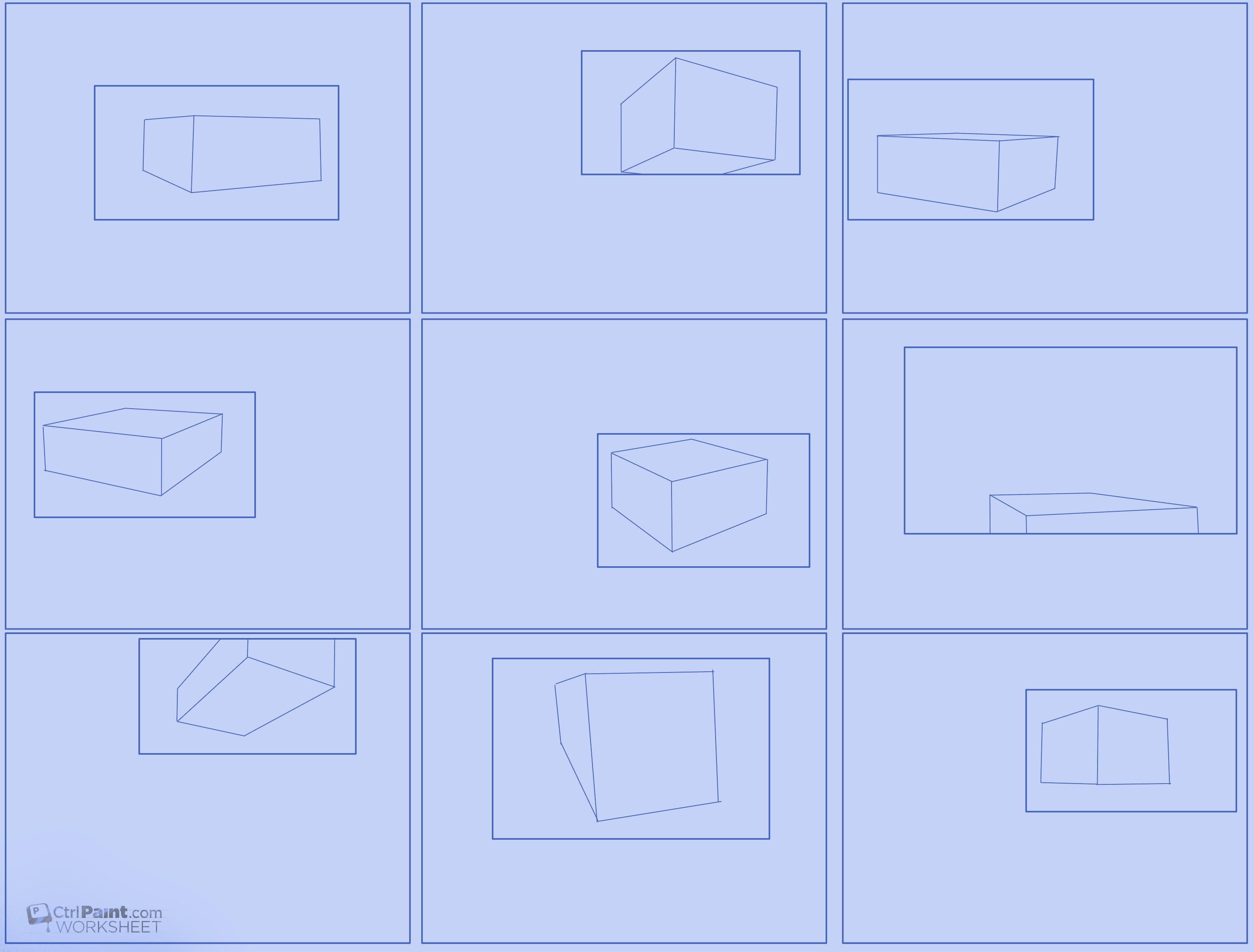
We're trained as children to think in terms of 'shape'. This is one of the things you have to overcome when learning to be an artist. Seeing shape is fine for some things, but observed drawing is best done in terms of form instead of shape. Shape is a 2D abstraction, form is seeing in 3d - with depth and volume. To finish out perspective week this video provides an exercise to help you envision form. All you need to do is go find some cool pictures of bugs!
And if you like this video, please remember to click the "Like" button at the bottom of the post! The only advertising for Ctrl+Paint is word of mouth, so I'm counting on you guys to spread the word. Thanks!
Things to consider: Draw through the object, envision the structure.
Even if you don't think you're making a 'perspective drawing', you are. To avoid some common mistakes, you first need to know where your horizon line is. This video explains how to find it, as well as common problems that result from ignoring it. Make sure to download the worksheet at the bottom of the page, and have fun!
And if you like this video, please remember to click the "Like" button at the bottom of the post! The only advertising for Ctrl+Paint is word of mouth, so I'm counting on you guys to spread the word. Thanks!
Things to consider: High angle, low angle
Worksheet Downloads:Horizon Line and Viewpoint Worksheet, Horizon Line and Viewpoint Worksheet (printer friendly version)
Perspective is incredibly important. It's also a subject that many artists avoid because it seems very stiff and technical. I created Perspective Sketching to teach the subject in a different way: freehand sketching. In my experience this approach to perspective changes it from deliberate and stuffy into a natural part of drawing. Though Photoshop is featured in the videos, all of the skills apply to traditional media or any other graphics software. These two newest additions to the Ctrl+Paint store will be available Friday August 10th. Though each series can be watched independently, they were designed as a pair.
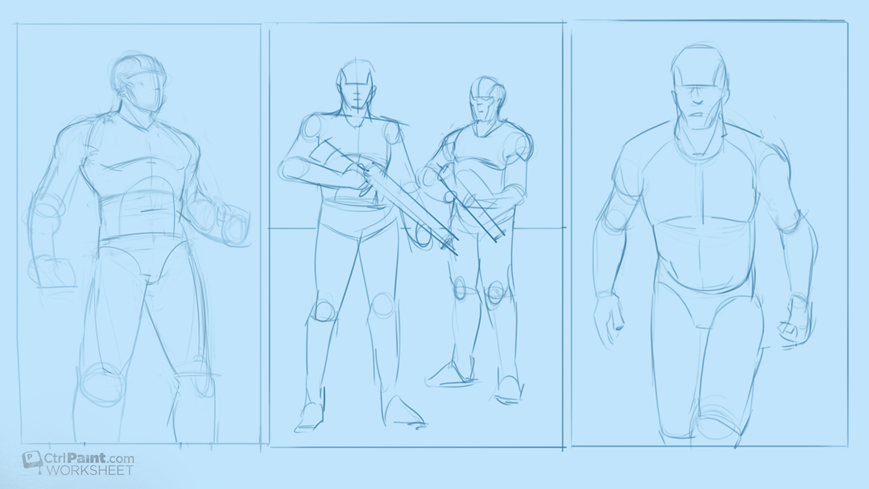
In the last assignment you gathered costume reference for real-world professions. Now it's time to have some fun with that visual research! I've provided you some mannequin drawings to use as the foundation for character designs. Your goal is to make a few designs that would actually fit into a modern context. I don't want to see any space marines -- just real world professions. Think it's easy to draw a police officer? How about a fire fighter? Now is your chance to find out. As an illustrator or concept artist you'll need to draw things like this surprisingly often. Additionally, they help build your visual library for costuming and will improve your ability to generate sci-fi and fantasy characters. Good luck! And if you like this video, please remember to click the “Like” button at the bottom of the post! The only advertising for Ctrl+Paint is word of mouth, so I’m counting on you guys to spread the word. Thanks!
Things to consider: Use specific details, "dress your model"
Recommended videos:Costume Reference, Costume Sketching
Worksheet Downloads:Basic Male Figures
I always use reference for my paintings. It's simply a matter of detail: there's too much stuff in this world to know about in detail, so I have to do a little visual research before I draw. Before the internet existed illustrators often kept "Morgue Files" or "Clipping Files" full of magazine photos. When an assignment came their way, they would go to their Morgue file and pull the appropriate images. Google image search and flickr have made the searching quite a bit easier, but the need is still exactly the same. In this video I'll explain how to create and manage a digital reference board - relying heavily on keyboard shortcuts. And if you like this video, please remember to click the "Like" button at the bottom of the post! The only advertising for Ctrl+Paint is word of mouth, so I'm counting on you guys to spread the word. Thanks!
Things to consider: Well-lit photos, specific details
Are you good at drawing straight lines? How about freehand straight lines? This video explores the art of drawing straight lines in Photoshop. There are a few different ways to approach it within the software - each having pros and cons. Ultimately, the best method will always be 'freehand', which takes a lot of practice. In a way, this assignment is just like a musician practicing scales or an athlete running drills. There's no trick to drawing a straight line freehand - it's simply a mechanical motion that you hone with practice. If you can't do it right away, that's normal. Good luck drawing straight lines! And if you like this video, please remember to click the "Like" button at the bottom of the post! The only advertising for Ctrl+Paint is word of mouth, so I'm counting on you guys to spread the word. Thanks!
Things to consider: Draw from the elbow and shoulder, keep your wrist rigid, have patience (this takes a lot of practice)
It's easy to think of an object as the subject, but what about the shadow it casts? Shadows have a huge impact on compositions and should be used intentionally. In terms of graphic shapes, cast shadows are often just as bold as the objects that cast them, though you might not be considering their potential. Especially for moody images filled with atmosphere and drama, shadows help your illustration tell a story. This exercise has you experiment with shadows at their most basic: with a simple still life. If you can make these shadows look interesting, just think what you could do with a space marine or dragon! And if you like this video, please remember to click the "Like" button at the bottom of the post! The only advertising for Ctrl+Paint is word of mouth, so I'm counting on you guys to spread the word. Thanks!
Things to consider: Viewing angle, composition motion and emphasis
Worksheet Downloads:Sketchup Still Life (sketchup file - requires free Sketchup software to use)
Ask any tabletop gamer and they'll be able to pull out a box of little extra pieces for customizing their plastic figures. Attaching these extra detail bits is a great way to save time. As a concept artist, you can save time in the same way - though your 'parts bin' is inside of Google Sketchup. This video shows how to use the Sketchup component system to add quick detail to your designs.
The previous video encouraged you to experiment with the colors of a character design. What about the color of the lines themselves? This time I invite you to take the same illustration and to experiment with colored lines. Black lines have their place, but you can add nuance to your images with intentionally colored lines. And if you like this video, please remember to click the "Like" button at the bottom of the post! The only advertising for Ctrl+Paint is word of mouth, so I'm counting on you guys to spread the word. Thanks!
Things to consider: Soft vs. Hard Materials, Lock Transparent Pixels
Recommended videos:Basic Color Schemes, Unify Your Palette, Alternative Masking pt.1 (Lock Transparent Pixels)
Worksheet Downloads:Gorilla character Worksheet
One of the best ways to learn about color and color relationships is to play. In this exercise, I invite you to use my illustration as a coloring book, and see what happens when you try different combinations and arrangements. Though the digital painting you end up with is not a portfolio piece, using my provided linework should keep you focused on the task at hand: changing the colors. And if you like this video, please remember to click the "Like" button at the bottom of the post! The only advertising for Ctrl+Paint is word of mouth, so I'm counting on you guys to spread the word. Thanks!
Things to consider: Complementary and Analogous Schemes, Lock Transparent Pixels
Recommended videos:Basic Color Schemes, Unify Your Palette, Alternative Masking pt.1 (Lock Transparent Pixels)
Worksheet Downloads:Gorilla character Worksheet
In the previous video we looked at simple rendering samples - now it's time to apply those techniques to a larger image. Though I've provided the foundation of this image for you, there's still a lot to be done. This sort of practice is great for improving your digital painting confidence and craftsmanship.
Do you have any tips for accomplishing this assignment? Was it harder or easier than you predicted? Let's hear about it in the comments! And finally, remember to have fun drawing.
Things to consider: No visible brushstrokes, edge control, brush and eraser only.
Recommended videos:Digital Painting 101 pt2 (Brushes), Brush Agility , Brush Control Basics
Worksheet Downloads:Dome Illustration Worksheet, Dome Illustration (Complete)
Are your brush strokes overlapped and messy looking? You're not alone. Many beginners suffer from this issue. To improve your technique, you'll need to practice making large strokes and using careful edge control -- which is exactly what this exercise was designed to help with. Look for the worksheet downloads at the bottom of the post.
Do you have any tips for accomplishing this assignment? Was it harder or easier than you predicted? Let's hear about it in the comments! And finally, remember to have fun drawing.
Things to consider: "Temp Layers", smooth rendering, edge control.
Recommended videos:Digital Painting 101 pt 4 (Layers), Alternative Masking pt 1 (Clipping Masks) , Brush Control Basics
Worksheet Downloads:Grayscale Rendering Samples, Color Rendering Samples
If you've ever created a silhouette sketch for a character design, what did you do next? All too often artists will consider these sketches in a binary way - each drawing is either a 'hit' or a 'miss', and they draw until a 'hit' happens. This video offers a modified approach to thumbnail sketching - using Photoshop masks to help quickly iterate on a single promising thumbnail. As I mention in the video, much of this idea originally came from the fantastic book The Skillful Huntsman, so make sure you check that out.
Recommended video: The Danger of Painting Silhouettes
Critique is the way that artists help one another improve, yet it's a subject that many never properly learn. You've probably been subjected to a harsh critique at some point - maybe someone said "That's bad" or "I don't really like that". The idea of a useful critique, however, is to help the artist - not insult them. This video explains how to deliver a useful critique - either to yourself or to another artist - by considering the "principles of design".
To get the most out of digital painting you'll need to let the computer do some of the work for you. Repeated objects are a great opportunity for Photoshop to shine, and this video shows how you can do real-time design using the 'smart objects' command. Unike traditional painting where you work from the beginning sketch to a finished painting, the digital process operates in a less linear way. If you can wrap your head around the possibilities, you'll end up saving time and achieving fantastic results!
In this episode of film studies, we'll dissect action movies in search of exciting poses. Just like in previous episodes, the way to get the most out of any given film still is to erase the context. As soon as you can distill the image down to a single, core, component it becomes far more versatile as reference and idea generation.
Movies can teach you a lot about storytelling. In this video I explain one way to use the beautiful colors found in movie stills, and apply them to your own illustration work. Like in the other videos in the Film Studies series, we dissect a frame and remove the context -- leaving us with a versatile piece of reference material.
This final entry in the Principles of Design series is all about "Unity", which is the state of balance in your image. Think of your illustration as a sauce -- you don't want any individual ingredient to stand out too strongly. Likewise, no single principle of design should stand out above another, they should all combine into a pleasant mixture. This is called "unity". If you missed any of the previous entries in this series, make sure to check out the Principles of Design Series!