Painters are not cameras. But if what you're striving for is realism, what is so different between an illustrator an a camera? This video discusses the painter's ability to manipulate reality for the sake of composition.
How much of an impact does text have in your composition? It's more than you think. This video explores the relationship between text and image, focusing on the relative visual 'weight' of text, contrast, and value. Book covers and websites are a great place to see this in action!
Having trouble deciding what to draw today? Be your own art director: give yourself an assignment! This exercise might seem contrived, but it's a fantastic way to break the paralyzing grip of a blank canvas. As the video shows, sometimes all you need to do is to give yourself a few limitations - and then the creativity naturally starts flowing. After all, artists are natural problem solvers --- they just need a problem to solve!
We'd all like more of it, but how should we spend our free time? It's a deceptively simple question, but I find myself asking it nearly every day. Should I spend an hour doing X or would it be better to do Y instead? What if all I want to do is Z? Though this video doesn't offer concrete answers, it will get you thinking about the bigger picture and how to stay vigilant about your goals. Blogs like www.lifehacker.com often talk about planning the hours of your workday, but I rarely see anyone discussing a longer (1,2,5 year) plans. These sort of 'big questions' are not easy to think about, but ignoring them completely can be a dangerous strategy. What is your strategy? Since I clearly don't offer a perfect solution, we'll all benefit from the discussion.
When building a portfolio, it's easy to forget about the little stuff. If you want to be a concept artist, though, your portfolio needs to prove that you think like one. This video discusses some of the overlooked types of art you might want to include in your own portfolio before looking for a job.
I'm excited to announce my first ever "full process" series, which will be available in the store 12/21/2012. Vehicle Design Start to Finish walks you through the process I use for my own professional work. In order to cover so much material in a single hour, you'll first need to be familiar with the the basics found in my other series. But if you want to see how I apply painting and design fundamentals to my professional work, this series is where to find it. Check it out in the Ctrl+Paint store starting this Friday! And remember - Christmas is coming up... are there any artists on your shopping list?
The entire process of design is filled with refinement: make a variety of options (thumbnails, color palettes, etc.) - and choose the best one. What if you could automate some of that? This video shows a technique to multiply your color roughs when making a character design in order to dramatically increase the total output. It's a bit messy, but you'll save a ton of time. If you want to see a similar process with thumbnails, make sure to watch this older Ctrl+Paint video.
You're familiar with the color picker, but are you using the best one? This video introduces three different ways to pick your colors in order to help you choose the one that is best for your working habits. The third party offering I mention in the video can be found here: Coolorus.
There's a difference between technique and design, and most images can be improved by making last-minute design decisions. Just like with a written essay, this is "editing". In this video I'll walk you through the last minute changes I made to a recent illustration, and why they made a crucial difference. It's easy forget that improving your artwork is more than simply improving your technical abilities. Just as important is the ability to make smart design and composition choices. If this is a subject you're interested in, you should check out the latest premium series "Design Basics" available in the Ctrl+Paint store.

As an artist it's worth considering film for more than it's entertainment value. PaintFlix is an ongoing series about beautiful movies found on Netflix streaming. These movies don't always have good stories, and I wouldn't fault you for watching them on mute. Bottom line: at $8 per month, Netflix streaming is a fantastic source of visual inspiration and I'd love to help with movie recommendations.

Titan A.E. (2000)
Are you a Star Wars fan? This is for you. Sure, this movie was a technical achievement for its time - but more importantly it is a sci-fi animated feature. Animated feature: period. As in...not strictly for kids. As a result the environments and themes are a bit grittier than your average animated children's movie.
What to watch for:
The "Color Story". Animated movies are great at using color to push the emotional undertones of their narrative. Since every color was painted by an artist, and not captured by a camera, it's all intentional. Make sure to see how each scene uses color to hammer home the current emotion.
The Backgrounds. If you haven't watched many 2D animated movies, you might not know that the backgrounds are actually hand-painted. This movie differs a bit by incorporating 3D elements, but most of what you see behind the characters are gorgeous gouache paintings. Want to work on your environment painting skills? Pause the movie and soak in the background .. it's a beautiful environment painting in every shot.
And when you're done watching:
Use the inspiration. Consider some of the techniques from the film studies series, and learn from this movie. Mood boards, composition sketches, color palettes... put "Titan A.E" to good use! I almost always leave the movie theater feeling inspired to create, but my schedule stops me from sitting down to paint. If you're able, plan in some extra time directly after watching to sit down and draw or paint. Have fun!
I was first introduced to the Gnomon Workshopback in college with a Feng Zhu video and I've been hooked ever since. One of my primary goals with Ctrl+Paint is to create a good entry point to learn digital painting. Eventually, though, you'll want to branch out into specific subjects that I can't hope to instruct. Whether it's sculpting, story-boarding, 3D modeling, or industrial design, the Gnomon Workshop has a DVD about it. If you've never seen the site before, it's worth a look. If you want more recommendations for books and websites, make sure to check out the Ctrl+Paint Resources page!
Even though it's counter-intuitive, sometimes you add a little salt to make a recipe taste sweeter. The same logic can be used to make your colors more vibrant! The principle at work in this short video is called "simultaneous contrast", or "color contrast" - and it is a sure-fire way to liven up your colors.
design_basics_preview
Since Ctrl+Paint began, I've been asked to make a series about creating concept art. Well, this is it! Earlier drafts took different forms, but finally I decided to make this series as versatile as possible and explore the rules of visual language. As a result, the ideas in this series can be applied to any subject-matter you like.
[UPDATE] This is now available in the store!
Concept art is all about visual design. After all, how do we know if we're looking at a hero or a villain? It's easy to forget that concept artists do more than just draw cool stuff. Their real task is to communicate with a viewer through shapes and colors - to make it absolutely clear who is the hero, and who is the villain. Design Basics, coming to the store on Wed. October 17th, examines this silent language: the language of design.
Whether you're designing props, characters, environments, or even your personal website - the rules are all the same. The videos in this series explain how to gather and utilize visual reference, plan your characters, and infuse them with the principles of good design. Unlike the other store offerings, this series is completely lecture-based and you won't see me drawing on screen. Instead it covers the process and iteration that lead to the final robot design; focusing on the idea process and not the tools themselves.
Art school is great, but it's not for everyone. Even for those that attend, it's only the beginning of their actual education. Most of the skills I use every day in my art are self taught. Whether it was in my spare time, on the job, or learned from friends: much of my technical knowledge was not learned at art school.This video explores the "making of" Ctrl+Paint to see what skills were necessary to create the site, and where I learned them. Ultimately, we're never prepared for huge projects. Even if you can draw a great still life, art college does not prepare anyone for the challenges of real life. Luckily, you never have to stop learning!
One of the most exciting subjects to paint is landscape - but many artists don't know where to begin. This video shows one approach. Just like in the previous video where we did a "Tiny Study", these are small thumbnail sketches. Creating a small drawing like this allows you to quickly explore compositions without investing too deeply in a single image. Most importantly, working small like this is a way to lower your expectations - it's a lot less stressful working on a tiny painting that can't fit any details. And if you like this video, please remember to click the “Like” button at the bottom of the post! The only advertising for Ctrl+Paint is word of mouth, so I’m counting on you guys to spread the word. Thanks!
Assignment: Create Landscape Thumbnails
Things to consider: Use the photo as color and material reference, not for shape.
Recommended videos:The "Tiny Study",

As an artist it's worth considering film for more than it's entertainment value. PaintFlix is an ongoing series about beautiful movies found on Netflix streaming. These movies don't always have good stories, and I wouldn't fault you for watching them on mute. Bottom line: at $8 per month, Netflix streaming is a fantastic source of visual inspiration and I'd love to help with movie recommendations.

Black Rain (1989)
This movie is directed by Ridley Scott. Sound familiar? Though his filmography is long, my favorites are "Alien" and "Bladerunner". So why "Black Rain"? Because you have probably never heard of it. At more than 20 years old it's easy to let a mediocre crime story like this slip through the cracks. That said, Scott's visual stamp is all over this moody mafia noir. Especially if you like rainy city streets and 80s neon, this movie is filled with gorgeous material. So hover your index finger on over the PrintScreen button, and let's get watching.
What to watch for:
Exposure and use of value. Since this movie is set primarily in dark spaces, "Black Rain" keeps the characters draped in shadow. As you can see in the screenshots (right) it's common for a light fixture to dominate the characters themselves, making the scenes moody and vague. Rim lighting, reflective puddles, and neon glow are used as striking elements of 2D pattern. Some movies use very high key lighting to show off the actors and expressions - this movie uses low key lighting to add punch to the mood.
Beautiful Locations. Set primarily in Japan, every set in this movie is jam packed with details. Night clubs, a metal smelting factory, modernist apartments - each and every set matters. Make sure to pause often in order to examine the set dressing, it's great stuff.
And when you're done watching:
Use the inspiration. Consider some of the techniques from the film studies series, and learn from this movie. Mood boards, composition sketches, color palettes... put "Black Rain" to good use! I almost always leave the movie theater feeling inspired to create, but my schedule stops me from sitting down to paint. If you're able, plan in some extra time directly after watching to sit down and draw or paint. Have fun!
If you're exploring various color palettes and moods for a piece, Photoshop has a secret tool to help you speed through the process. It's actually not a secret, but many illustrators simply don't know about it. Unlike other color overlay techniques, this command will replace colors based off of their value. This means that your highlights will be treated differently than your shadows, etc. To properly use this technique you'll need to know how to create a gradient in Photoshop, though it's not discussed in the video. Luckily, gradients are a very old feature for Photoshop and Illustrator, so it isn't hard to learn about them on the internet.
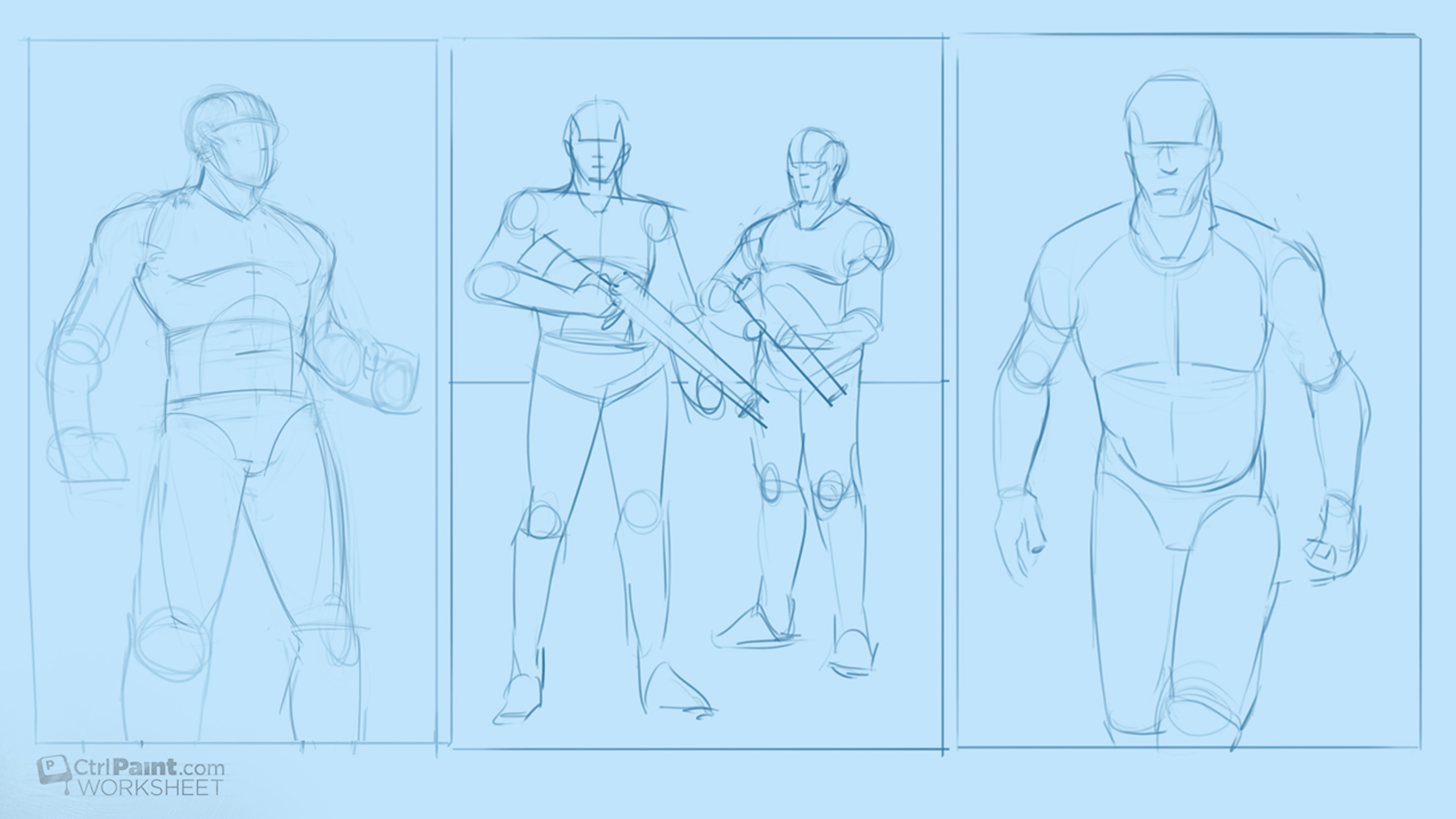
In the last assignment you gathered costume reference for real-world professions. Now it's time to have some fun with that visual research! I've provided you some mannequin drawings to use as the foundation for character designs. Your goal is to make a few designs that would actually fit into a modern context. I don't want to see any space marines -- just real world professions. Think it's easy to draw a police officer? How about a fire fighter? Now is your chance to find out. As an illustrator or concept artist you'll need to draw things like this surprisingly often. Additionally, they help build your visual library for costuming and will improve your ability to generate sci-fi and fantasy characters. Good luck! And if you like this video, please remember to click the “Like” button at the bottom of the post! The only advertising for Ctrl+Paint is word of mouth, so I’m counting on you guys to spread the word. Thanks!
Assignment: Create realistic character designs (from reference)
Things to consider: Use specific details, "dress your model"
Recommended videos:Costume Reference, Costume Sketching
Worksheet Downloads:Basic Male Figures
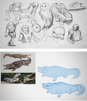
I always use reference for my paintings. It's simply a matter of detail: there's too much stuff in this world to know about in detail, so I have to do a little visual research before I draw. Before the internet existed illustrators often kept "Morgue Files" or "Clipping Files" full of magazine photos. When an assignment came their way, they would go to their Morgue file and pull the appropriate images. Google image search and flickr have made the searching quite a bit easier, but the need is still exactly the same. In this video I'll explain how to create and manage a digital reference board - relying heavily on keyboard shortcuts. And if you like this video, please remember to click the "Like" button at the bottom of the post! The only advertising for Ctrl+Paint is word of mouth, so I'm counting on you guys to spread the word. Thanks!
Assignment: Create career-specific reference boards (Scuba diver, fire-fighter, etc.)
Things to consider: Well-lit photos, specific details
It's easy to think of an object as the subject, but what about the shadow it casts? Shadows have a huge impact on compositions and should be used intentionally. In terms of graphic shapes, cast shadows are often just as bold as the objects that cast them, though you might not be considering their potential. Especially for moody images filled with atmosphere and drama, shadows help your illustration tell a story. This exercise has you experiment with shadows at their most basic: with a simple still life. If you can make these shadows look interesting, just think what you could do with a space marine or dragon! And if you like this video, please remember to click the "Like" button at the bottom of the post! The only advertising for Ctrl+Paint is word of mouth, so I'm counting on you guys to spread the word. Thanks!
Assignment: Create interesting shadow shape compositions with mundane objects.
Things to consider: Viewing angle, composition motion and emphasis
Worksheet Downloads:Sketchup Still Life (sketchup file - requires free Sketchup software to use)