Free transform, as we saw in the previous video, can be a very precise tool.  In this video we'll be creating a room full of ornate windows - and use the power of smart objects and the free transform tool to save time.  Though this workflow might seem like 'cheating', modern illustrators take advantage of a wide array of uniquely-digital tools.   

Posted
AuthorMatt Kohr
3 CommentsPost a comment

Free transform is often a beginner's first tool.  As such, it's easy to overlook some of it's more advanced (and hidden) functionality.  In this video we'll examine the practical uses of modifier keys while free transforming ellipses into position. 

Posted
AuthorMatt Kohr
5 CommentsPost a comment

In today's video we'll complete the trim sheet mini-series by adding the final details.   As you'll see in the video, this technique is more 'collage' than it is 'painting', though still requires a solid understanding of linear perspective.  If you've never tried working in this way, here's your invitation!  Give it a whirl!

Related Videos

Posted
AuthorMatt Kohr
4 CommentsPost a comment

Basic Rendering 3, available in the Ctrl+Paint store, continues where part 2 left off.  We'll explore the process of adding realism to your imaginary forms, and steps to improve your grayscale rendering.  The series focuses on fundamental skills and theory that apply to concept art, illustration, and painting in general.  

Hand Painting 

One approach for detail is to use photographic overlays.  Basic rendering 3 shies away from this method, focusing instead on hand-painting techniques.  Though commercial work often involves photo-overlay as a time-saving technique, it's important to learn the manual method first.

Worksheets

Just watching isn't enough.  To practice your new skills, this series includes a variety of study sheets and PSD files.  These provided homework assignments aren't glamorous, but they're important for mastering the basics.  

Posted
AuthorMatt Kohr
4 CommentsPost a comment

Basic Rendering 4 concludes the series by showcasing a real-world illustration process featuring the tools, technique, and theory from parts 1-3.  First we explore the importance of composition and ‘value pattern’.  This process informs the creation of our thumbnail sketch and digital rough, which is then enlarged and polished into a final illustration.  Most importantly, the series focuses on the design choices I make throughout the process (both successes and failures), which can be applied to any illustration.  

Posted
AuthorMatt Kohr
3 CommentsPost a comment

Before we jump into the final photo overlay phase, this video provides a word of caution: watch your overlaps.  A common issue with layers set to blending modes like 'overlay' and 'multiply' is that they pile up and get out of control.  In part 3 of this series we'll see how layer groups can help avoid this sloppy result without sacrificing any versatility.  

If you've watched the two previous parts, you might be confused.  Yes, I did add an additional video.  If all goes according to plan, this will now be a four part mini-series, and we'll complete the detailing phase next week.  Stay tuned!

Related Videos

Posted
AuthorMatt Kohr
7 CommentsPost a comment

Today we'll continue work on the texture 'tile-set' for our concept painting example.   This part of the process allows you to get to the fun stuff next week.  If you're not sure how to make ''tiling textures", make sure to watch this older video 

Related Videos

Posted
AuthorMatt Kohr
6 CommentsPost a comment

When drawing with paper and pencil, rotating your page is second nature.  Doing so allows your arm to more naturally draw challenging curves and straight lines.  Why not work the same way in Photoshop?  This video explores a personal favorite tool of mine: Rotate Canvas.

To follow along with the video, make sure to download your canvas rotation practice sheet.  Also, this tool is a great candidate for a custom keyboard shortcut.  Once you see how cool rotate canvas is, you'll want to use it a lot.

Posted
AuthorMatt Kohr
24 CommentsPost a comment

We're often our own worst enemy when it comes to forward progress.  It's good to be critical, but what if you're being too hard on yourself?   This is an argument to help put things in better perspective. 

Posted
AuthorMatt Kohr
44 CommentsPost a comment
screenshots.png

The default keyboard shortcuts are not set in stone.  They're not designed for digital painters.  If you spend significant amounts of time painting in Photoshop, you owe it to yourself to design a better system.  luckily, Photoshop makes it easy to re-bind the key commands.  

Despite all of this, you might be dragging your feet - because designing a keyboard shortcut layout from scratch is an intimidating task.  With this challenge in mind I've created the Shortcut Layout Designer, which is a set of PSDs to help you brainstorm possible new layouts.  It consists of two documents: one full of labeled key icons, and and the other is an  empty template to brainstorm your designs.  Since I've done the hard work for you, the barrier to designing your own keyboard shortcut layout is much lower.  

Ultimately, this template won't rewrite your keyboard shortcut file.  Think of it as a visual blueprint.  you'll still need to manually enter the commands in the Edit > Keyboard Shortcuts menu.  

If you're interested in hearing more about Keyboard Shortcuts, make sure to watch these other videos:  Actions, Custom Keyboard Shortcuts, Custom Controllers, and The Brush Tool Maze.

Posted
AuthorMatt Kohr
20 CommentsPost a comment

In Line Removal parts 1 and 2 we talked about transitioning from a drawing to a painting.  Using a photo-study of a skull, we slowly removed the initial line drawing and replaced it with painted edges.  In today's video I'll showcase a totally different approach - working with a flat document instead of a layered one.  Neither technique is 'correct', but it's nice to know multiple ways to achieve the same result.  

Posted
AuthorMatt Kohr
4 CommentsPost a comment

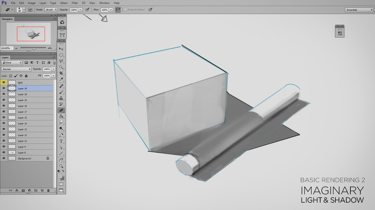
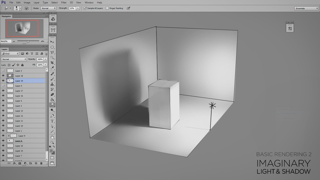
It makes me extremely happy that basic rendering remains one of the most popular topics on Ctrl+Paint.  Describing form through light and shadow truly is the foundation of realistic painting.  With this in mind, Basic Rendering 2: Imaginary Light and Shadow continues where Basic Photoshop Rendering left off.  In this new premium series, you'll learn to apply the observational skills you learned in Basic Rendering 1 onto imaginary objects.  Though I focus primarily on simple shapes, the series shows how general rules apply equally well to complex illustrations.  If you want to improve the realism of your concept art and illustrations, make sure to chweck out this series in the Ctrl+Paint store.  

Available Sep. 12th in the Ctrl+Paint Store

Posted
AuthorMatt Kohr
9 CommentsPost a comment

It doesn't matter how much detail your image has, most people won't need to look at it on the side of a bus.  Since we can agree on that point, why would you save an image for the web with such gigantic resolution?  This video explores the best way to save your documents for viewing on the internet. 

Posted
AuthorMatt Kohr
9 CommentsPost a comment

In a previous video I firmly stated that the smudge tool is not good for blending.  Well, I've changed my mind.  This video updates my opinion, and offers settings to add nuance and control to the smudge tool's blending ability.

Posted
AuthorMatt Kohr
11 CommentsPost a comment

Using the warp tool is a great way to apply overlays to your illustration.  What you might not realize, though, is that it's a lot more powerful when mixed with "Smart Objects".  In this video we'll take inspiration from video game texture mapping to take our overlays to an entirely new level.

If you've not seen the "Decal Warp" technique mentioned in this video, make sure to  watch it first.

Posted
AuthorMatt Kohr
12 CommentsPost a comment