When you paint a still life, are you learning from the shadows or just copying what you see? This video explores the different forms shadows can take and how to invent them for your own illustrations. Though every object casts a shadow, many beginners don't spend much time studying them!
Making colors appear vibrant can be a challenge. In this video I'll discuss a trick to grab the viewer's attention with smart use of strong, saturated colors. And if you think the answer is "use a lot of saturation", you might be surprised to by the approach. After all, color is all about relativity.
One of the best qualities of working digitally is the flexibility - and no tool showcases this better than the "Puppet Warp". It's a tool I've avoided showing in a video so far because it's relatively new to Photoshop. Additionally, it's very specialized and doesn't transfer well to traditional drawing. But if you need to slightly change the pose of your character, and you've already painted tons of details... there's nothing better than a quick puppet warp.
If you're not familiar with the warp tool that I mention in the video, you might like watching these two videos: Applying decals and thumbnail chop and warp.
design_basics_preview
Since Ctrl+Paint began, I've been asked to make a series about creating concept art. Well, this is it! Earlier drafts took different forms, but finally I decided to make this series as versatile as possible and explore the rules of visual language. As a result, the ideas in this series can be applied to any subject-matter you like.
[UPDATE] This is now available in the store!
Concept art is all about visual design. After all, how do we know if we're looking at a hero or a villain? It's easy to forget that concept artists do more than just draw cool stuff. Their real task is to communicate with a viewer through shapes and colors - to make it absolutely clear who is the hero, and who is the villain. Design Basics, coming to the store on Wed. October 17th, examines this silent language: the language of design.
Whether you're designing props, characters, environments, or even your personal website - the rules are all the same. The videos in this series explain how to gather and utilize visual reference, plan your characters, and infuse them with the principles of good design. Unlike the other store offerings, this series is completely lecture-based and you won't see me drawing on screen. Instead it covers the process and iteration that lead to the final robot design; focusing on the idea process and not the tools themselves.
Is the feel of your USB tablet not quite right? Customize it! This video takes a look into the way Wacom tablets function in an attempt to make them feel more comfortable to draw on. If you missed the previous videos, you might want to watch the ones on Stylus grip and Stylus "Tip Feel".
So you're off on the art-learning journey, but do you have a destination in mind? If you haven't thought that far yet, you might want to. I say this because drawing and painting can be learned in different ways, and each way supports a different end goal. This video explores the idea of intentionally learning: making sure to stay on target and immerse yourself in the appropriate resources.
What should I draw today? This is possibly the most common question to any artist - beginner or pro. Unless you're given an assignment by your client/boss, this question has a tendency to paralyze. Since I work much more fluidly from an assignment with narrow guidelines, I've begun 'generating' fake assignments for my personal art. This is a fun way to have spontaneous ideas and get yourself out of a drawing rut. As I mention in the video, here are some links to fantasy and sci-fi generators to get your ideas flowing: From donjon: Sci-fi character, Sci-Fi Spaceship, Fantasy Character, Fantasy Castle, Weather
From Chaotic Shiny: Flag, Musical Instrument, Fighting arena, Magical familiar
Special Bonus: I spoke with the creator of Chaotic Shiny and she asked for generator ideas! She liked the idea of these being used for artwork, and is willing to field ideas for custom generators. If you have any ideas for random generators, please put them in the comments! I'll make sure to pass along the results.
For some, a standard keyboard is plenty... But have you considered going further? This video showcases my personal hardware setup and how I use it for painting. Before you go out and spend lots of money on USB devices I want to be very clear: none of this is essential. However, as I state in the video, if you often spend long stretches on the computer you might want to give this a thought. Additionally, your hardware solution will be different than mine. The best part about going down this road is that each artist has different needs and workflows, so each setup will take a different form.
1) Cintiq 21UX by Wacom (currently replaced with newer models) This is the ultimate painting tool. I was using standard USB tablets for 10 years before I got one of these, but I might have trouble going back at this point. Very expensive, but wonderful for painting.
2) SpaceExplorer USB by 3Dconnexion If you do much 3D modeling, you might like one of these. I use this exclusively for Sketchup, and it allows me to use my right hand for sculpting, while my left hand stays on the SpaceExplorer controlling the camera and issuing hotkeys. Though it's not cheap, it has dramatically changed the process of 3D modeling for me. If you want to see this in action, watch this video -- it's a great demonstration, and essentially sold me on the device.
3) Shuttle Pro 2 by Contour (available on Amazon) This is the heart of my painting interface. I like the prominent knob for changing my brush size, and the overall ergonomic layout. If you were to get one piece of custom hardware, this might be a good pick.
4) Multi-function Gaming Panel (MFP) by CH products (see pictures here) (available at @ Buy.com) This is a platform with buttons that you position and then bind to keyboard shortcuts or macros. Very cool, but also very expensive. If you want total ergonomic control, this is as flexible as it gets. Want to see it in action? This video from E3 2009 should help explain it.
5) X-Keys 24 Programmable Keypad by PI Engineering These are my lowest priority buttons such as media controls, opening specific folders with a single press, etc. A variety of things that I couldn't easily hard-bind my standard keyboard to do. Besides.. you can always use a few more buttons, right?
To finish up the mini-series on advanced masking, this video introduces the concept of "selection building". Though this is not an official title, it's a process by which you make the job of creating complex selections easier and less frustrating. This technique is especially useful if you're adding graphic or pattern overlays on to your characters. If this seems abstract or challenging make sure to give it a try for yourself -- like other types of masking, it's much easier once you've had a hands-on experience.
If you're not familiar with masking, these are good videos to watch first: Masking 101 pt.1, Masking 101 pt. 2, Masking 101 pt. 3
To follow along with the video, here's the robot PSD for download.
And to learn about applying 2D decals using the warp tool watch this video: Warp Tool
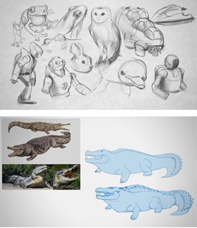
The gap between observational drawing and drawing from your imagination can be tricky for beginners. The idea of this exercise is to start with a grounding in the real, observed, world - and then adding your own imaginary details. Though this doesn't have much practical application in a portfolio, it's a great first step towards drawing dragons and space marines.
Posted
7 CommentsPost a comment
Edge control is often the key to efficient painting. As you've seen in Advanced Masking pt 1, nesting masks adds a high level of flexibility to the painting process. This video will continue the idea of nesting masks by exploring complex selections. Even if these ideas may seem abstract at first, they are worth learning. In my experience, once you begin to utilize methods like these you're able to approach Photoshop from an entirely different angle --- and will find yourself problem solving in a whole new way.
If you're not familiar with masking, these are good videos to watch first: Masking 101 pt.1, Masking 101 pt. 2, Masking 101 pt. 3
If you want to experiment with the PSD file from the lesson, here is the robot for download.
Are you using masks to their full potential? Do you even know what masks are? If you answered no to either of those questions, get ready to have your mind blown. Masking is one of the most abstract concepts in Photoshop painting, but in my opinion it's the secret for truly efficient workflows. Though it doesn't feel like a traditional painter's process, it's a skill no digital painter should live without. This video focuses on painting textural overlays and the concept of 'nested masking' for maximum versatility.
If you're not familiar with masking, these are good videos to watch first: Masking 101 pt.1, Masking 101 pt. 2, Masking 101 pt. 3
If you want to experiment with the PSD file from the lesson, here is the robot for download.
The bad news: Ctrl+Paint isn’t going to be your source for learning anatomy. I only want to teach subjects that I feel totally comfortable with, and frankly... anatomy isn’t one of them. The good news: anatomy is already very well documented! This post is going to become a ‘living document’ about anatomy instruction. I’m starting it out with a few of my favorites, and I’ll add additional sources as I learn about them. Do you have a favorite? Send me an email or add it to the comments!
Constructive anatomy
Of the two major approaches to figure drawing, this is the technique designed for drawing from your imagination. In short, you break the body down into geometric forms in order to envision them from any possible camera angle. Illustrators, comic artists, and concept artists often work in this way because it is versatile and does not require exact reference. This type of drawing absolutely requires perspective drawing, so make sure you’re comfy with that before you dive into the human form.
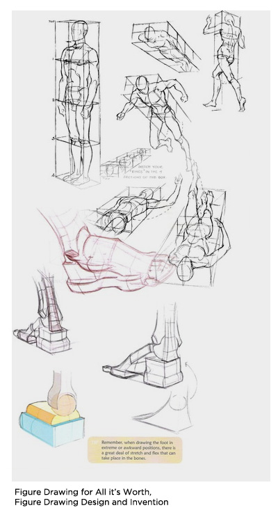
Why it’s useful: It’s versatile. If you’re working with deadlines, you might not have the ability to find a model or shoot your own reference photos. It’s also a great building block for stylized drawings and designing creatures, monsters, and dinosaurs. If you’re able to simplify a human body, the same exact skills help you envision anatomy that doesn’t exist in real life. Additionally, this skill helps in designing human-like creatures such as robots and some vehicles.
Where it falls short: Specific details. It’s easy to fall into a “Barbie and Ken” trap in which you always draw your figures the same way. In order for this process to work you’ll be simplifying the characters in your mind - creating a visual ‘shorthand’. When rushing, this often leads to your characters looking repetitive. It’s important to use photo reference for specific details like interesting haircuts, clothing styles, and faces.
Resources:
Figure Drawing Design and Invention by Michael Hampton - This book is fantastic. I’ve read a lot of books which help simplify anatomy into geometric pieces, but this is by far my favorite. Get it in print, not as a .PDF -- you’re going to want this one on your desk at all times.
Andrew Loomis - I’ve mentioned him in previous videos, but he’s worth mentioning again. This classic commercial illustrator amazing at simplifying the body into a formula. If you’ve ever read a “How to draw ____ characters” book, it’s a bit like that.... but 1000 times more useful. Truly a master.
The Vilppu Drawing Manual by Glen Vilppu - He’s a modern master following in the tradition of Andrew Loomis. I had the pleasure of attending a lesson with Glen and he’s an amazing instructor. Not to be missed.
Observed Anatomy
The term "classical figure drawing", or observed anatomy, involves using a using a live model or photo as reference. If you go to art school, this is how you’ll be introduced to anatomy. Artists have been working in this way for centuries, and it’s a fantastic challenge for any skill level. This sort of classical painting and drawing are often used for fine art.

Why it’s useful: Learning to see a person in front of you and transfer their likeness onto a page is priceless. There’s a reason artists have been painting portraits in this manner for most of recorded history. Even if you don’t use this for your commercial work, it’s a fantastic way to practice and learn about the body.
Where it falls short: It’s not nearly as versatile as constructive anatomy. If a comic artist needed to pose a live model for each panel of her comic page, she’d never finish the book. Used for more academic pursuits, drawing from life is generally a slower and less commercial process. Especially if you are working with larger than life settings like fantasy and Sci-Fi, observed anatomy can be impractical.
Resources:
The Artist’s Complete Guide To Drawing the Head by William Maughan - This book is the best resource I’ve ever read on portraiture. He focuses on the shapes of shadows to achieve likeness... and... it works! Certainly a must read.
Do you have more resources to add? Let's hear about them in the comments! I'll be updating the post as time goes on.
Art school is great, but it's not for everyone. Even for those that attend, it's only the beginning of their actual education. Most of the skills I use every day in my art are self taught. Whether it was in my spare time, on the job, or learned from friends: much of my technical knowledge was not learned at art school.This video explores the "making of" Ctrl+Paint to see what skills were necessary to create the site, and where I learned them. Ultimately, we're never prepared for huge projects. Even if you can draw a great still life, art college does not prepare anyone for the challenges of real life. Luckily, you never have to stop learning!
Have you ever worked on a painting for so long that you fooled yourself into thinking it was good? You were in "The Monkey House". It's a common affliction for artists, and hopefully this video will allow you to learn from my mistakes. Many of the videos on this site explain technique or concepts -- this video it different: it's a painting story. A story that ends with me wasting the better part of a day. And just think, it all could have gone differently if I remembered to make thumbnail sketches!
One of the most exciting subjects to paint is landscape - but many artists don't know where to begin. This video shows one approach. Just like in the previous video where we did a "Tiny Study", these are small thumbnail sketches. Creating a small drawing like this allows you to quickly explore compositions without investing too deeply in a single image. Most importantly, working small like this is a way to lower your expectations - it's a lot less stressful working on a tiny painting that can't fit any details. And if you like this video, please remember to click the “Like” button at the bottom of the post! The only advertising for Ctrl+Paint is word of mouth, so I’m counting on you guys to spread the word. Thanks!
Assignment: Create Landscape Thumbnails
Things to consider: Use the photo as color and material reference, not for shape.
Recommended videos:The "Tiny Study",
We've talked about starting small and working bigger - but this time we're going to start tiny. Color is challenging to work with, and much of the instruction on Ctrl+Paint is done in grayscale. If you want to start working directly in color I recommend the 'tiny study' exercise. When you're looking at a photo filled with rich details it's tempting to re-create each pebble and tree. This exercise forces you to simplify what you're seeing, skip the details, and only paint the colors. Even though the end result won't impress your friends, it helps hone your eye for color and builds a foundation for landscape painting.

As an artist it's worth considering film for more than it's entertainment value. PaintFlix is an ongoing series about beautiful movies found on Netflix streaming. These movies don't always have good stories, and I wouldn't fault you for watching them on mute. Bottom line: at $8 per month, Netflix streaming is a fantastic source of visual inspiration and I'd love to help with movie recommendations.

Black Rain (1989)
This movie is directed by Ridley Scott. Sound familiar? Though his filmography is long, my favorites are "Alien" and "Bladerunner". So why "Black Rain"? Because you have probably never heard of it. At more than 20 years old it's easy to let a mediocre crime story like this slip through the cracks. That said, Scott's visual stamp is all over this moody mafia noir. Especially if you like rainy city streets and 80s neon, this movie is filled with gorgeous material. So hover your index finger on over the PrintScreen button, and let's get watching.
What to watch for:
Exposure and use of value. Since this movie is set primarily in dark spaces, "Black Rain" keeps the characters draped in shadow. As you can see in the screenshots (right) it's common for a light fixture to dominate the characters themselves, making the scenes moody and vague. Rim lighting, reflective puddles, and neon glow are used as striking elements of 2D pattern. Some movies use very high key lighting to show off the actors and expressions - this movie uses low key lighting to add punch to the mood.
Beautiful Locations. Set primarily in Japan, every set in this movie is jam packed with details. Night clubs, a metal smelting factory, modernist apartments - each and every set matters. Make sure to pause often in order to examine the set dressing, it's great stuff.
And when you're done watching:
Use the inspiration. Consider some of the techniques from the film studies series, and learn from this movie. Mood boards, composition sketches, color palettes... put "Black Rain" to good use! I almost always leave the movie theater feeling inspired to create, but my schedule stops me from sitting down to paint. If you're able, plan in some extra time directly after watching to sit down and draw or paint. Have fun!
If you're exploring various color palettes and moods for a piece, Photoshop has a secret tool to help you speed through the process. It's actually not a secret, but many illustrators simply don't know about it. Unlike other color overlay techniques, this command will replace colors based off of their value. This means that your highlights will be treated differently than your shadows, etc. To properly use this technique you'll need to know how to create a gradient in Photoshop, though it's not discussed in the video. Luckily, gradients are a very old feature for Photoshop and Illustrator, so it isn't hard to learn about them on the internet.
Photoshop's versatility is a great asset. One moment you might be penciling a comic page, and the next you're laying in colors. Do you change your workspace along with the task? This video introduces the 'workspace' feature which keeps your palettes organized. Since each task requires a different set of tools and information onscreen, it's nice to save preset workspaces to reflect each one. Like many user interface features this may seem simple and uninteresting - but once you begin using Photoshop for long sessions you'll understand its importance.